Trust and reviews
Trust and reviews sections tell customers what to expect from your store: what other customers say about you, and the promises you make on delivery, payment and returns. You find them under Trust and reviews in the Add section list.
Add a trust or reviews section
Steps:
- From your Shopify admin, go to Online Store > Themes.
- Find Heirloom, and then click Edit theme.
- Open the template that you want to change, and then click Add section.
- Under Trust and reviews, select a section.
- Click Save.
Testimonials
The testimonials section shows quotes from your customers as cards, in a grid or a carousel. Each card can show the quote, a star rating, a photo, the customer’s name and a role, such as “Home cook, Leeds”.
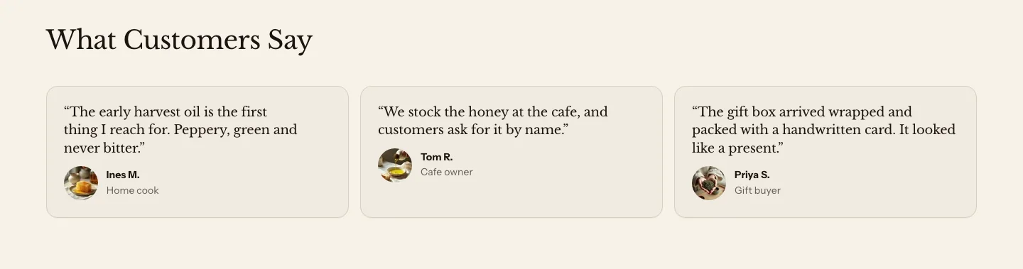
You can add these blocks:
- Testimonial
- Custom Liquid
- App blocks from apps you install
Add a heading above the quotes in the section’s Section header block. Each Testimonial block is one quote.
- Grid shows one card per row on phones, up to two on tablets, and Columns on desktop on larger screens.
- Carousel shows the cards in one row that customers swipe, or drag with a mouse, with the next card peeking in from the edge on smaller screens.
To show a row of customer photos or reviews from an app, see Social proof and Show reviews from an app.
Settings
These settings apply to testimonials and social proof, which are versions of the same section.
Layout
- Display: Cards shows each quote in full. Avatars shows only the customers' photos, overlapping in a row. The row sits beside the heading from tablet width up, and above it on phones.
- Layout: How the cards are arranged, when Display is Cards.
- Columns on desktop: How many cards sit side by side on large screens. In a carousel, this sets how many cards are in view at once.
- Style: Card draws each quote on its own panel. Plain shows the quotes on the section background.
- Show stars: Shows each testimonial's star rating. Turn it on, and then set Stars on each testimonial.
- Show arrows: Shows previous and next buttons above the carousel. Customers can also swipe, scroll or use the keyboard.
Section style
- Color scheme: The colors of the section and the cards.
- Vertical padding: The space above and below the section.
Testimonial settings
- Text: The customer's words.
- Name: The customer's name. In the Avatars display, it's the name screen readers announce for the photo, and its initials stand in when there's no photo.
- Role: A short line under the name, such as where the customer lives or what they bought.
- Stars: The customer's rating, from 1 to 5 stars. 0 shows no stars. It shows when Show stars is on in the section.
- Image: A photo of the customer, shown in a circle.
Social proof
Social proof is a testimonials section with Display set to Avatars: a row of overlapping customer photos beside a short heading, such as “Loved by home cooks”. Each testimonial shows only its photo, or the initials of the name when there’s no photo. A photo of any shape fills its circle. To make one, add Testimonials and set Display to Avatars. It has the same settings as testimonials.

Show reviews from an app
Heirloom doesn’t collect product reviews itself. Reviews apps that support Online Store 2.0 themes add app blocks, which you place in the theme editor like any other block. Check your app’s own instructions for the names of its blocks.
- To show a reviews widget in a full-width band on any page, add an Apps section, and then add your app’s block to it. Learn more in Layout and apps.
- To show reviews on a product page, add the app’s block to the Product section. Learn more about product information blocks.
Many reviews apps also save each product’s average rating to Shopify’s standard product review metafields. Heirloom’s Product rating block reads those metafields, so the stars on your product pages match your app, and products without reviews show no stars.
Trust bar
A trust bar is a row of short promises, each with an icon, a heading and a line of text, such as “Chilled Delivery”, “Secure Checkout” or “Easy Returns”. Use it near the top of your home page, or above the footer on every page.
No Heirloom template comes with a trust bar. When you add one, it starts with four sample items: Delivery, Secure Checkout, Order Updates and Questions. Change them to the promises your store makes.

You can add these blocks:
- Trust item
- Custom Liquid
- App blocks from apps you install
Add a heading above the row in the section’s Section header block, if you want one. Each Trust item block is one promise.
- Grid places the items in rows: one column on phones, more on tablets, and Columns on desktop on larger screens.
- Carousel shows the items in one row that customers swipe, or drag with a mouse, with optional previous and next buttons and autoplay.
- Marquee scrolls the items slowly across the band, like a ticker.
Settings
These settings apply to the trust bar and the contact strip, which are versions of the same section. Card items keep their own card edges, and dividers belong to Plain items.
Layout
- Layout: How the items are arranged.
- Columns on desktop: How many items sit side by side on large screens. The trust bar never shows more columns than it has items.
- Style: Plain, the default, shows the items on the section background. Card draws each item on its own panel. In both, each icon is a bare symbol in the text color.
- Alignment: Left puts each icon beside its text. Center centers each item, with the icon above its text.
- Show dividers between items: Draws a thin line between Plain items that sit side by side. Card items keep their own edges, so this setting has no effect on them.
- Speed: How fast the items move, when Layout is Marquee.
- Show arrows: Shows previous and next buttons, when Layout is Carousel.
- Autoplay: Moves the carousel to the next item on its own. It pauses while a customer's pointer or keyboard focus is in the carousel, and stops for good once a customer uses the carousel.
- Change every: How many seconds pass before the carousel moves on.
Section style
- Color scheme: The colors of the band, the items and the icons.
- Vertical padding: The space above and below the band.
Trust item settings
- Icon: An icon from Heirloom's icon library. Select Custom image to use your own image, or None for no icon.
- Custom icon: The image used when Icon is Custom image. Use a simple, square image with a transparent background.
- Heading: The promise in a few words, such as Free delivery over $50.
- Text: One line that backs up the promise, such as when orders ship.
- Link: Makes the item a link, for example to your shipping policy.
An item with no heading and no text doesn’t show on your online store.
Contact strip
A contact strip is a trust bar set up for your contact details: plain items for email, phone and a place to visit, under a “Get in touch” heading. Learn how to set one up in Store and contact.
Related
- Learn more about product information blocks.
- Learn more about apps and custom Liquid.
- Learn more about using apps with your theme in Shopify’s Help Center.