Footer
The footer sits at the end of every page of your online store. You build its columns from blocks, such as footer menus, a short note about your store, social media icons and an email signup. A bottom row closes the footer with your copyright line, policy links, country and language selectors and payment icons.
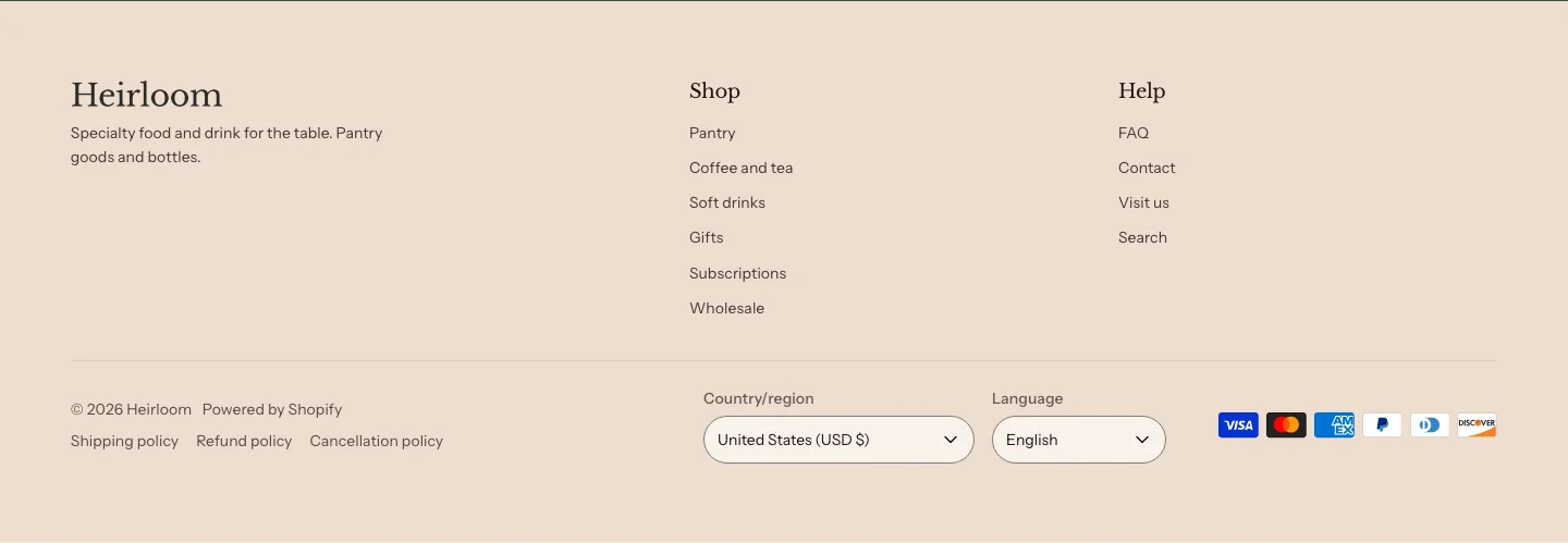
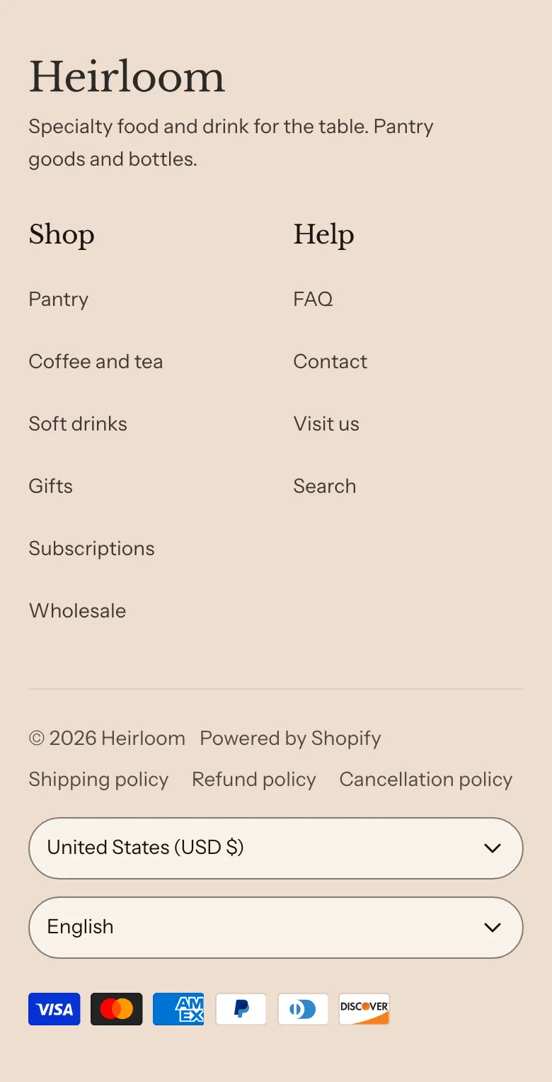
The footer is part of the footer section group, so you edit it once and the change shows on every page.
Edit the footer
Steps:
- From your Shopify admin, go to Online Store > Themes.
- Find Heirloom, and then click Edit theme.
- In the sidebar, under Footer, click Footer.
- To add a column, click Add block, and then select a block. To change a column, click its block.
- Click Save.
Footer columns
Each block that you add to the footer is one column.
You can add these blocks:
- Brand
- Footer menu
- Text
- Image
- Email signup
- Social media icons
- Group
- Custom Liquid
- App blocks from apps you install
With Desktop layout set to Wrap to rows, the columns share the row by count. On tablets, they sit two to a row. On wider screens, each block gets its own column. With two blocks, the first column is a little wider. With three or four, the first and last are a little wider, and four blocks sit two to a row until the screen is wide enough for all four.
With Desktop layout set to One row, the brand, every menu and the signup sit side by side on large screens, however many blocks there are. The first block and any block that holds a signup get more room, and the menus share the rest. Use it for a footer with a brand note, several menus and a signup.
On phones, Footer menu blocks sit two to a row, and every other block takes a full row. A phone shows the brand, then the menus side by side, then the signup. To put two blocks in one column, such as a heading over social media icons, add a Group block and then add the blocks inside it.
Settings
Layout
- Desktop layout: Wrap to rows shares the row by the number of blocks. One row keeps the brand, every menu and the signup side by side on large screens. Phones show two menus to a row either way. The Heirloom, Foxglove and Honeysuckle styles start with One row, and Marigold and Larkspur start with Wrap to rows.
- Hide the signup when the page ends with one: Hides the footer's signup when the last section on the page already has an email signup, such as a Newsletter section, or when the footer group holds a Newsletter section, so customers see one signup. The newsletter popup doesn't count. It covers an Email signup block placed straight in the footer too, and the other footer columns close up to fill the space. It's on in the footer that every theme style starts with.
Section style
- Color scheme: The footer's colors, including the bottom row.
- Vertical padding: The space above and below the footer.
Footer menus
A Footer menu block shows one of your menus as a column of links. Use one for each list you want, such as Shop, Help and About us. The column headings and any Heading block set to Small, such as a signup’s heading, share one size, so a signup never outranks the navigation beside it. The page that a customer is on is underlined in the list, not made bold.
Steps:
- From your Shopify admin, go to Content > Menus, and then create or edit the menu that you want in the footer.
- In the theme editor sidebar, under Footer, click a Footer menu block, or add one.
- Under Footer menu, click Change, and then select your menu.
- Click Save.
Footer menu settings
- Heading: The column's heading. Leave it blank to use the menu's own title.
- Footer menu: The menu to show. The column lists the menu's top-level links. Links nested under them don't show in the footer.
Brand
A Brand block shows your store’s logo, or your store name in your heading font when you have no logo, with a short line of text and your social media icons under it. Add it as the first column, so customers see who the store is before the menus.
- Logo width: How wide the logo is. It appears only when Theme settings > Brand has a logo.
- Text: A line or two about your store, shown under the logo or name.
- Show social media icons: Shows an icon for each profile that you add in Theme settings > Social media. Nothing shows when you haven't added any.
Bottom row
The bottom row is always the last part of the footer. You can’t remove or move it, but you can turn off each part of it. Click Bottom row in the sidebar to change it. The copyright line reads the year and your store name. Type a Copyright line to add your own words after them, or turn on Use the copyright line instead of the store name to show the year and then only your words, such as a company name.
- Copyright line: Shows after the year and the store name, or in place of the name when you turn that on.
- Use the copyright line instead of the store name: Shows the year and then your copyright line, such as your company name, in place of the store name. It shows when you've typed a Copyright line.
- Show “Powered by Shopify”: Shows a Powered by Shopify link after the copyright line.
- Show policy links: Shows links to the store policies that you've added in Settings > Policies in your Shopify admin, such as your refund policy and privacy policy.
- Show country and language: Appears when you sell in more than one country or language.
- Show Follow on Shop in the footer: Shows a Follow on Shop button, so customers can follow your store in the Shop app. It appears only where Shop offers following.
- Show payment icons: Shows an icon for each payment method that's turned on for your store.
On phones, the bottom row lines up on one left edge. The country selector sits on its own row, with the language selector below it. The Update button stays hidden until a customer picks a different country or language, and then it appears beside the language selector. The selector labels are hidden but still read aloud by screen readers.
Each part of the bottom row hides when there’s nothing to show. For example, the policy links hide when you haven’t added any policies, and the country and language selectors hide when you sell in one country and one language. The selectors work for customers who have JavaScript turned off, too.
Social media icons and email signup
The footer accepts the same Social media icons and Email signup blocks as other sections. Social media icons link to the accounts that you add in Theme settings > Social media. Learn about both blocks in Theme blocks.
Related
- Learn more about menus in Shopify’s Help Center.
- Learn more about adding store policies in Shopify’s Help Center.
- Learn more about social media settings.
- Learn more about the header and announcement bar.