Food and drink
Food and drink sections describe what you sell the way a cook or a taster would: what goes well together, how to make a dish, and what a product tastes like. You find them under Food and drink in the Add section list.
Add a food and drink section
Steps:
- From your Shopify admin, go to Online Store > Themes.
- Find Heirloom, and then click Edit theme.
- Open the template that you want to change, and then click Add section.
- Under Food and drink, select a section.
- Click Save.
Pairings
The pairings section shows cards of two things that go together, such as a cheese and a chutney, or a coffee and a biscuit. Each card shows both sides with an image and a name, joined by a plus sign, followed by an optional note and button.
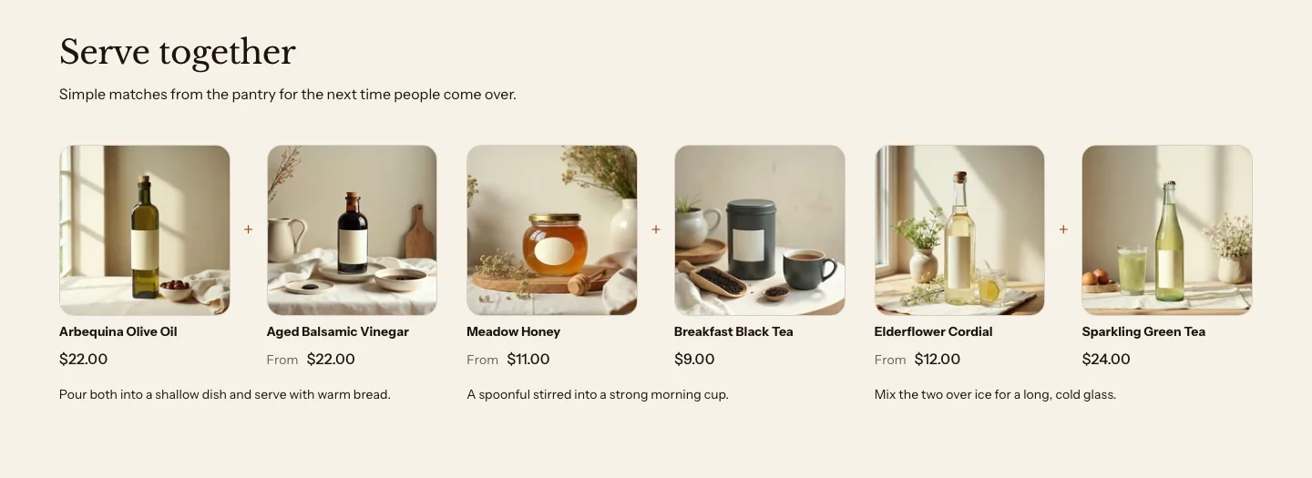
You can add these blocks:
- Pairing
- Custom Liquid
- App blocks from apps you install
Add a heading above the cards in the section’s Section header block. Each Pairing block is one card. A side can be a product from your store, or any image with a label, such as a dish you don’t sell.
The pairs line up with the heading. A centered Section header centers them, and a left-aligned one sets them at the left edge. A pair with no images or products reads as its two names on one line, with no frames.
Settings
Layout
- Show: Picked products replaces your pairing cards with product cards once you pick products in Pairing products. With no products picked, your pairing cards show. Pairs always shows your pairing cards and ignores any picked products. Stores that never set this keep Picked products.
- Columns on desktop: How many cards sit side by side on large screens. The section never shows more columns than it has cards. Phones show one card per row, and tablets show up to two. The cards in a row share their rows, so notes and buttons line up.
- Style: Plain sets the pairs straight on the section's background. Card puts each pair on a card, and the images inside lose their own frame, so a card never holds a second box. Stores that never set this get Plain.
- Pairs show: Images and names shows each side's image or product photo above its name. Names only sets each pair as two names on one line, with no images or prices, and hides Image shape, Show price and the image pickers. A picked product's name still links to it.
- Image shape: The shape of the images on every card. It shows when Pairs show is Images and names.
- Show price: Shows the price under each picked product on a pairing card. It shows when Pairs show is Images and names and the section shows your pairing cards, not picked products.
Products
- Pairing products: Picked products show as cards in place of the pairs, unless Show is Pairs.
Section style
- Color scheme: The colors of the section and the cards.
- Vertical padding: The space above and below the section.
Pairing settings
- Product A: A picked product supplies the image, name, price and link.
- Image A: The image for the first side, when no product is picked. It also stands in for a picked product that has no images. It is hidden when Pairs show is Names only.
- Label A: The name of the first side, when no product is picked.
- Product B: A picked product supplies the image, name, price and link.
- Image B: The image for the second side, when no product is picked. It also stands in for a picked product that has no images. It is hidden when Pairs show is Names only.
- Label B: The name of the second side, when no product is picked.
- Text: A short note under the pair, such as why they work together or how to serve them.
- Button label: The text on the card's button. The button shows when it has both a label and a link.
- Button link: Where the button goes, for example a recipe or a collection.
Recipe
The recipe section shows one recipe: its name, a photo, an introduction, the yield, prep and total times, the ingredients and the method. Add it to a blog post template for a recipe post, or to a product template to show how to cook with a product.
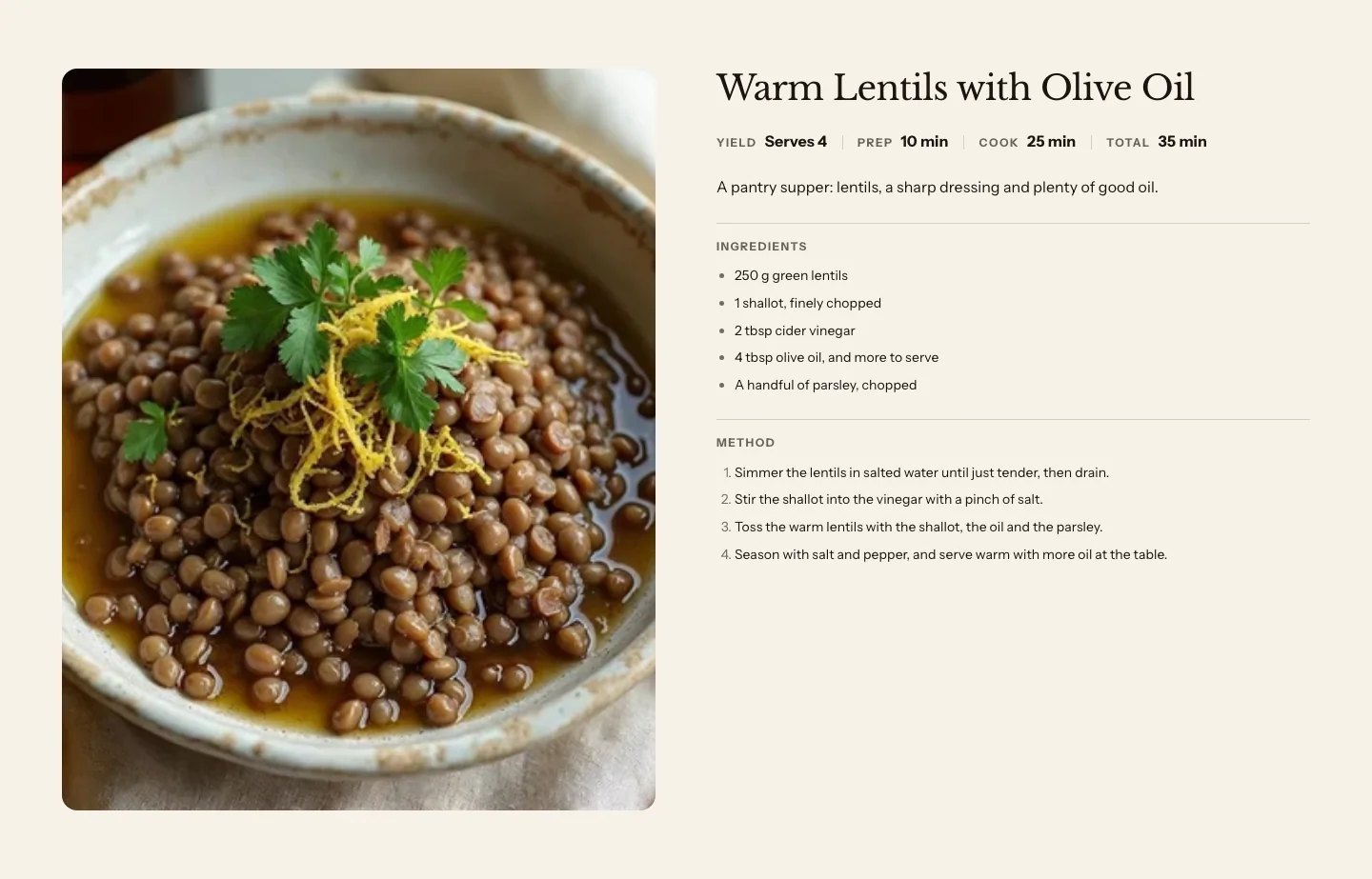
You can add these blocks under the method:
- Theme blocks, such as Heading, Text, Button and Image
- App blocks from apps you install
Use the blocks for something that goes with the recipe, such as a Button that links to the ingredients in your store.
With an image, and Layout set to Photo beside, the photo and the recipe sit side by side on large screens, and the photo stays in view while customers scroll through a long method. With Photo above, a smaller photo sits beside the name, facts and introduction, and the ingredients and the method sit in two columns under them. On phones, the photo sits above the recipe. Without an image, the recipe takes the full width.
A recipe that you add from Add section starts with a short sample recipe, Warm Lentils with Olive Oil, so you can see the layout. Replace it with your own recipe, or connect the fields to metafields, before you publish. A recipe with every field empty shows a greyed sample in the theme editor only, and nothing on your online store.
Settings
Content
- Heading: The name of the recipe.
- Text: A short introduction to the recipe.
- Yield: Servings or amount, shown as written.
- Prep time (minutes): Whole minutes, or connect a number or text metafield.
- Cook time (minutes): Minutes of cooking. It shows between the prep and total times, and search engines read it as the cook time.
- Total time (minutes): Whole minutes, or connect a number or text metafield.
- Ingredients: Use a bulleted list: each item is read as one ingredient by search engines.
- Method: Use a numbered list: each item is read as one step by search engines.
Labels
- Ingredients heading: The heading over the ingredients, such as "You will need".
- Method heading: The heading over the method.
- Yield label: The label beside the yield.
- Prep label: The label beside the prep time.
- Cook label: The label beside the cook time, such as "Bake" or "Simmer".
- Total label: The label beside the total time.
Media
- Image: A photo of the finished dish.
- Image shape: The shape of the photo's frame.
Layout
- Layout: Photo beside puts the photo next to the recipe. Photo above puts a smaller photo beside the name and introduction, with the ingredients and the method in two columns under them.
- Collapsible ingredients and method: Turns Ingredients and Method into rows that customers open and close. Both are open to start, with only a line between the two rows. The rows work without JavaScript.
- Image position: Which side the photo sits on, on large screens, with Photo beside selected.
- Image width: How much of the row the photo takes, on large screens.
- Vertical position: How the photo lines up with the recipe beside it.
- Keep image sticky while scrolling: Keeps the photo in view while customers scroll past a long method. For customers who set their device to reduce motion, the photo scrolls with the page instead.
Section style
- Color scheme: The colors of the section.
- Vertical padding: The space above and below the section.
Enter times as whole minutes, such as 20. Heirloom shows them in minutes in each customer’s language. A time that isn’t a number, such as “Overnight”, shows as written.
Recipes in search results
The recipe section adds recipe data to the page for search engines, so the recipe can show with its photo, times and ingredients in search results. The data is added only when the recipe has a name, an image, an ingredients list and a method list. On a blog post with no recipe image, the post’s own image is used.
To fill the same section on every recipe post, connect each field to a metafield. Learn more in Blogs and recipes.
Tasting notes
The tasting notes section shows the stages of a tasting, such as Nose, Palate and Finish, as a list or in columns. Use it for a coffee, a tea, an olive oil or a cheese.
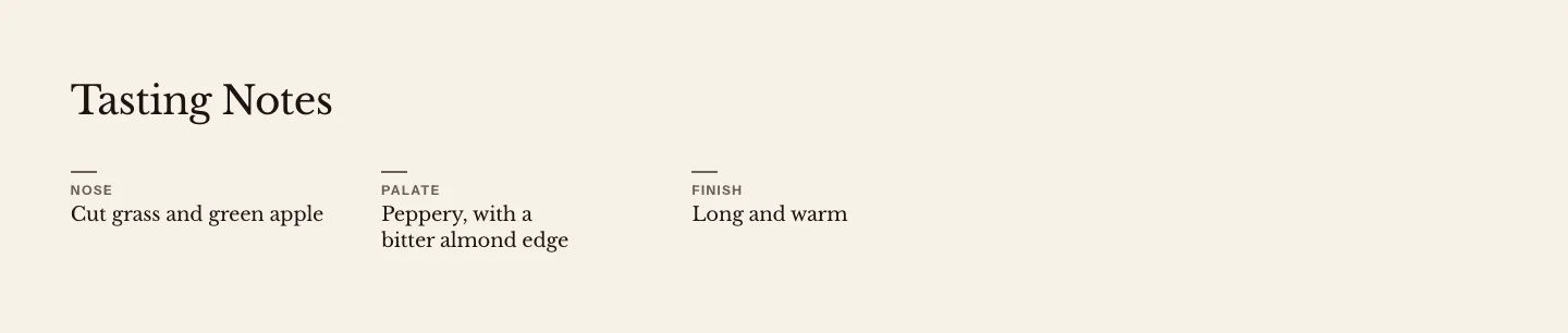
You can add these blocks under the notes:
- Custom Liquid
- App blocks from apps you install
The notes themselves are a Tasting notes block that’s always part of the section. Select it in the sidebar to change how the notes are laid out, and to add or remove notes. Add a heading above the notes in the section’s Section header block.
Settings
Layout
- Content width: How wide the notes can get.
Section style
- Color scheme: The colors of the section.
- Vertical padding: The space above and below the section.
Tasting notes block settings
These are the same settings that the Tasting notes block has on a product page.
- Display: List shows each note as a row, with a line between rows. On wider screens, the label sits in its own column beside the text. Columns places the notes side by side.
- Columns on desktop: How many notes sit side by side on large screens, with Columns selected. It's never more than the number of notes. On phones, the notes stack.
- Style: Card draws the notes together on one panel. Plain shows them on the section background.
Tasting note settings
- Label: The stage of the tasting, such as Nose, Palate or Finish.
- Heading: The note in a few words, such as Toasted almond.
- Text: More about this stage.
Related
- Learn more about food and drink details on product pages.
- Learn more about blogs and recipes.
- Learn more about metafields in Heirloom.