Text
Text sections help customers read and compare: a short welcome under your banner, answers to common questions, a few columns about delivery and returns, or a table that compares your gift boxes. You find them under Text in the Add section list.
Add a text section
Steps:
- From your Shopify admin, go to Online Store > Themes.
- Find Heirloom, and then click Edit theme.
- Open the template that you want to change, and then click Add section.
- Under Text, select a section.
- Click Save.
Comparison table
A comparison table sets up to three options side by side in columns, with one row for each thing that customers compare. Use it to compare sizes, gift boxes or subscription plans, such as a row for Jars included across Pantry, Pour and Host.
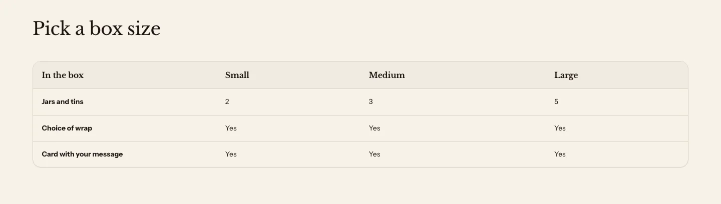
You can add these blocks:
- Table row
You name the columns in the section’s settings, and each Table row block adds a row. The section’s heading is in its Section header.
Settings
Column headings
- Label: Heads the first column; leave blank to show "Feature".
- Column 1 heading: The heading of the first column of values. Leave it blank to hide this column in every row.
- Column 2 heading: The heading of the second column of values. Leave it blank to hide this column in every row.
- Column 3 heading: The heading of the third column of values. Leave it blank to hide this column in every row.
Layout
- Alignment: Left or Center. It aligns the column headings and their values. Row labels stay on the left.
- Content width: How wide the table can get. Full width spans the page column. Wide and Standard cap the table at a reading width and center it.
Section style
- Color scheme: The section's colors.
- Vertical padding: The space above and below the section.
Table row settings
- Heading: The row's first cell, such as the feature being compared.
- Column 1 value: The row's value in the first column, such as a number, Yes or a short phrase.
- Column 2 value: The row's value in the second column.
- Column 3 value: The row's value in the third column.
The comparison table is a real table, with header cells and a name for screen readers, so customers who use assistive technology can move through it by row and column.
Rich text
Rich text is a heading, a short paragraph and a button. Use it to welcome customers under your banner, or to introduce the section that follows.

Rich text is a version of the Custom section, set up with a Heading, a Text and a Button block. You can add, remove and reorder its blocks, and put them side by side. Learn about its settings in Layout and apps.
Brand statement
A brand statement is one centered heading on a soft background, with extra space around it. Use it for a single sentence about what your store stands for.
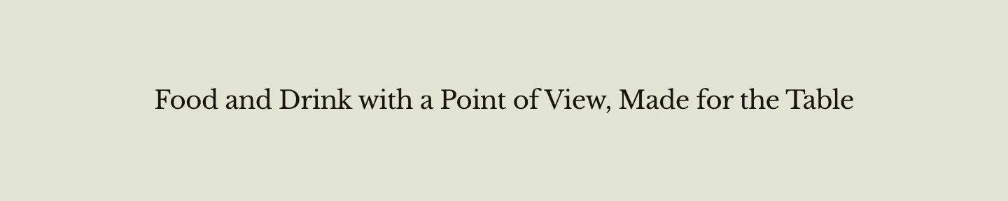
The brand statement is a version of the Custom section with one Heading block. Learn about its settings in Layout and apps.
Pull quote
A pull quote shows one quotation in large type, centered on the page. Use it for a line from a review, a producer or a press mention.

The pull quote is a version of the Custom section with one Quote block set to the medium size, centered. Quote size also offers Small and Large. Add the quotation, and the name and role of the person who said it, in the Quote block. Learn about the Quote block in Theme blocks.
Collapsible content
Collapsible content is a heading over a list of rows that customers open and close, such as Shipping and Returns. Each row can hold your own text, a page from your online store or one of your store policies.
To build it, add an FAQ section and add a row for each item. In each row, leave Answer blank, and then choose a Page or a Store policy. Add your policies in Settings > Policies in your Shopify admin. A row that holds a page or a policy is never marked up as a question for search engines. Learn about the FAQ section below.
To add a row of this kind inside another section, such as a product page, use the Collapsible row block. Learn about the block in Theme blocks.
FAQ
An FAQ shows a list of questions. Customers click a question to show its answer. Use it for delivery, storage or allergen questions, such as how long an opened jar keeps.
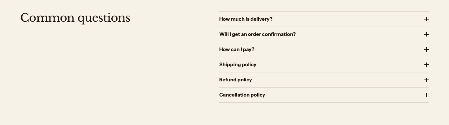
You can add these blocks:
- Question, page or policy
Each Question, page or policy block is one row. A row is a question with a written answer, or a store policy or a page from your online store. The section’s heading is in its Section header. The rows open and close for customers who have JavaScript turned off, too. Every expandable row in Heirloom looks the same: a plain row with a plus that turns into a minus.
On a computer screen, an FAQ that isn’t full width sets a left-aligned heading beside the list, with the list on the right at its Content width, so the section spans the page instead of leaving the right half empty. A centered heading keeps the heading and list in one centered column. On phones the heading always sits above the list.
Settings
Layout
- Style: Plain, the default, shows the questions on the section's background, divided by thin lines like the product page's disclosures. Card puts them on a panel with a thin border and rounded corners.
- Open only one question at a time: Opening a question closes the one already open.
- Content width: How wide the list of questions can get. Beside a left-aligned heading on a computer screen, it is the width of the list on the right.
- Full width: Makes the list span the page column, so it lines up with the sections around it, such as on a product page. When it's on, Content width is hidden.
Section style
- Color scheme: The section's colors.
- Vertical padding: The space above and below the section.
Row settings
- Question: The question, as customers would ask it. If the row holds a page or a policy, a blank heading shows the page's or the policy's own title.
- Answer: The answer. You can use bold, italic and links.
- Page: A page from your online store. The row shows the page's content when Answer is blank.
- Store policy: One of your store policies, as written in Settings > Policies. The row shows it when Answer and Page are blank.
- Open by default: Shows the answer when the page loads.
Heirloom marks up the questions and answers as FAQ structured data, which search engines can read. Only questions with both parts are included. A page or policy row is not marked up, and a list of only page and policy rows adds no FAQ structured data at all.
Columns
Columns shows content side by side, such as an image, a heading and a short paragraph in each. Use it for your product ranges, the steps of your delivery or what makes your store different.
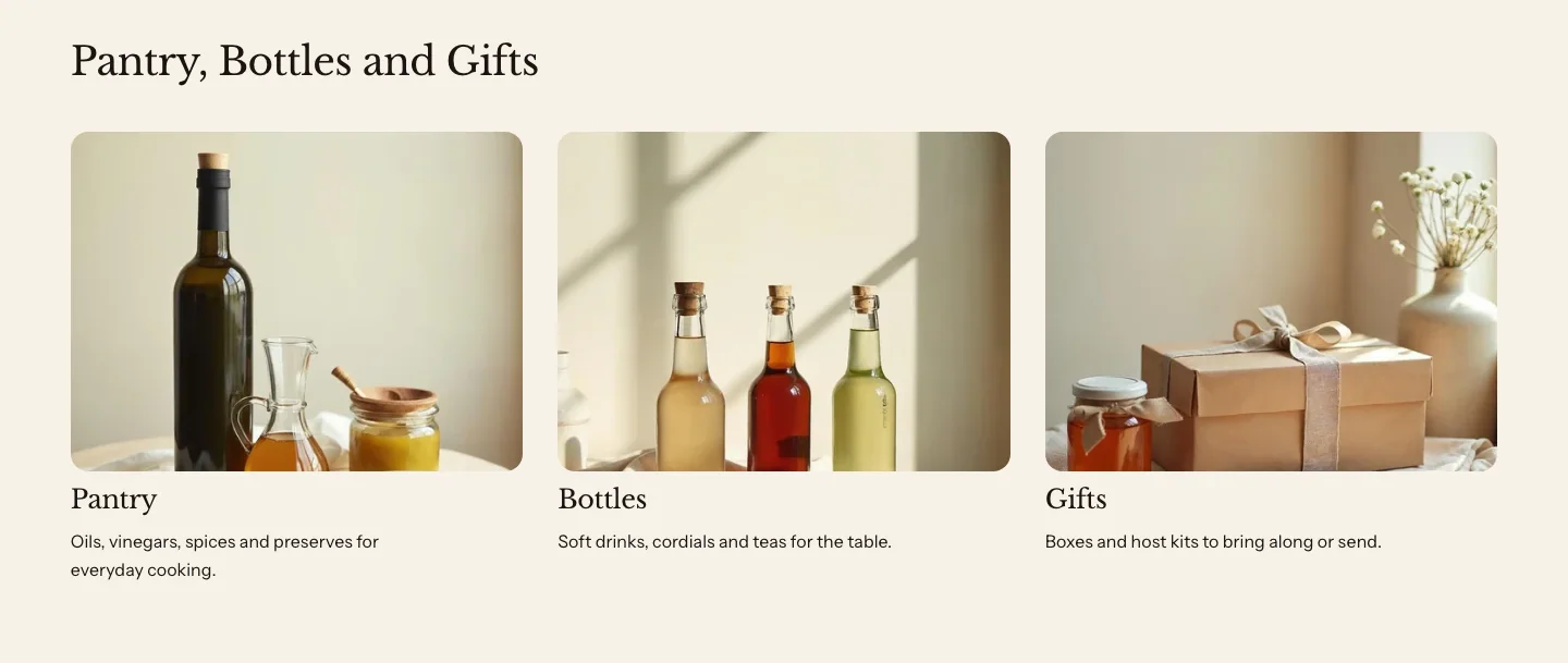
You can add these blocks:
- Column
- Custom Liquid
- App blocks from apps you install
Each Column block is one column, and you build it from theme blocks, such as an Image, a Heading and a Text. The section’s heading is in its Section header.
Settings
These settings apply to every Columns section, including the text columns, icon list and feature list on this page, and the values, team and statistics layouts on the Storytelling page.
Layout
- Layout: Grid shows the columns in rows. Carousel shows them in one row that customers swipe, or drag with a mouse.
- Columns on desktop: How many columns sit side by side on large screens. On tablets, the row holds up to three, and four columns become two.
- Columns on mobile: How many columns sit side by side on phones.
- Spacing: The space between the columns. With Plain style the steps are larger, so Small, Medium and Large read as clearly different spacings.
- Style: Plain, the default, shows the content on the section's background, and an Icon block draws its bare symbol in the text color. Card puts each column on a panel with a thin border and rounded corners, and icons sit on a tinted circle.
- Numbering: Numbers puts a number, starting at 01, at the top of each column. To mark columns with an icon or an image instead, add an Icon or Image block to each column.
- Alignment: How the content lines up inside each column.
- Show arrows: Shows previous and next buttons on the carousel.
- Autoplay: Moves the carousel on its own. It stops for good when a customer uses the carousel, and it doesn't run for customers who set their device to reduce motion.
- Change every: How many seconds pass before the carousel moves, when Autoplay is on.
Section style
- Color scheme: The section's colors.
- Vertical padding: The space above and below the section.
Column settings
- Link: Makes the whole column a link. Buttons and links inside the column keep their own destinations.
Colors
- Use a different color scheme: Gives this column its own color scheme instead of the section's.
- Color scheme: The column's colors, when Use a different color scheme is on.
The carousel pauses while a customer’s pointer or keyboard focus is inside it, while it’s out of view and while the browser tab is in the background. Customers can also scroll it by touch, trackpad or keyboard without JavaScript.
Text columns
Text columns are a Columns section with a heading and a paragraph in each column, without a panel. Use them for short guidance, such as how to browse, choose and check out. To make them, add Columns: its Style is Plain to start with.

Icon list
An icon list is a Columns section with an icon, a heading and a line of text in each column, centered, four to a row and two to a row on phones. Use it for delivery, payment and order updates. To make one, add Columns, set Columns on desktop to 4, Columns on mobile to 2 and Alignment to Center, keep Style on Plain, and then add an Icon block to each column.

Feature list
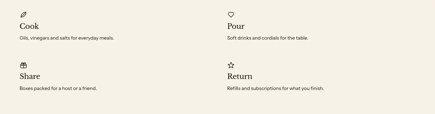
A feature list is a Columns section with a small icon, a heading and text in each column, two to a row with extra space between them. Use it to describe what your store offers, such as Cook, Pour and Share. To make one, add Columns, set Columns on desktop to 2 and Spacing to Large, keep Style on Plain, and then add an Icon block with Icon size set to Small to each column.
Tabbed content
Tabbed content shows one panel of content at a time, under a row of tabs. Use it to keep long details tidy, such as Ingredients, Storage and Serving ideas.

You can add these blocks:
- Tab
- Custom Liquid
- App blocks from apps you install
Each Tab block is one tab, and you build its panel from theme blocks, such as a Text, an Image or a Button. The section’s heading is in its Section header.
Settings
Layout
- Content width: How wide the tabs and panels can get. It shows only when Full width is off.
- Full width: Lets the heading and tabs span the whole page column, so the heading starts at the same left edge as the sections around it.
Section style
- Color scheme: The section's colors.
- Vertical padding: The space above and below the section.
Tab settings
- Heading: Names the tab; leave blank to show "Details".
Customers move between tabs with a click, or with the arrow keys, Home and End once a tab has keyboard focus. Customers who have JavaScript turned off see every tab’s heading and content, one after another.
Related
- Learn more about theme blocks.
- Learn more about the custom section.
- Learn more about storytelling sections.