Products
Product sections show your products outside their own pages: a row of bestsellers on your home page, a single product that customers can buy in place, or recommendations under a product. You find them under Products in the Add section list.
Product cards in these sections follow your Product cards theme settings, such as the image shape and whether quick add shows. Learn more in Product cards.
Add a product section
Steps:
- From your Shopify admin, go to Online Store > Themes.
- Find Heirloom, and then click Edit theme.
- Open the template that you want to change, and then click Add section.
- Under Products, select a section.
- Click Save.
Collection tabs
Collection tabs show several collections in one section, with a tab for each. Customers click a tab to see that collection’s products. Use it on your home page to offer a few ways in, such as Pantry, Bottles and Gifts.
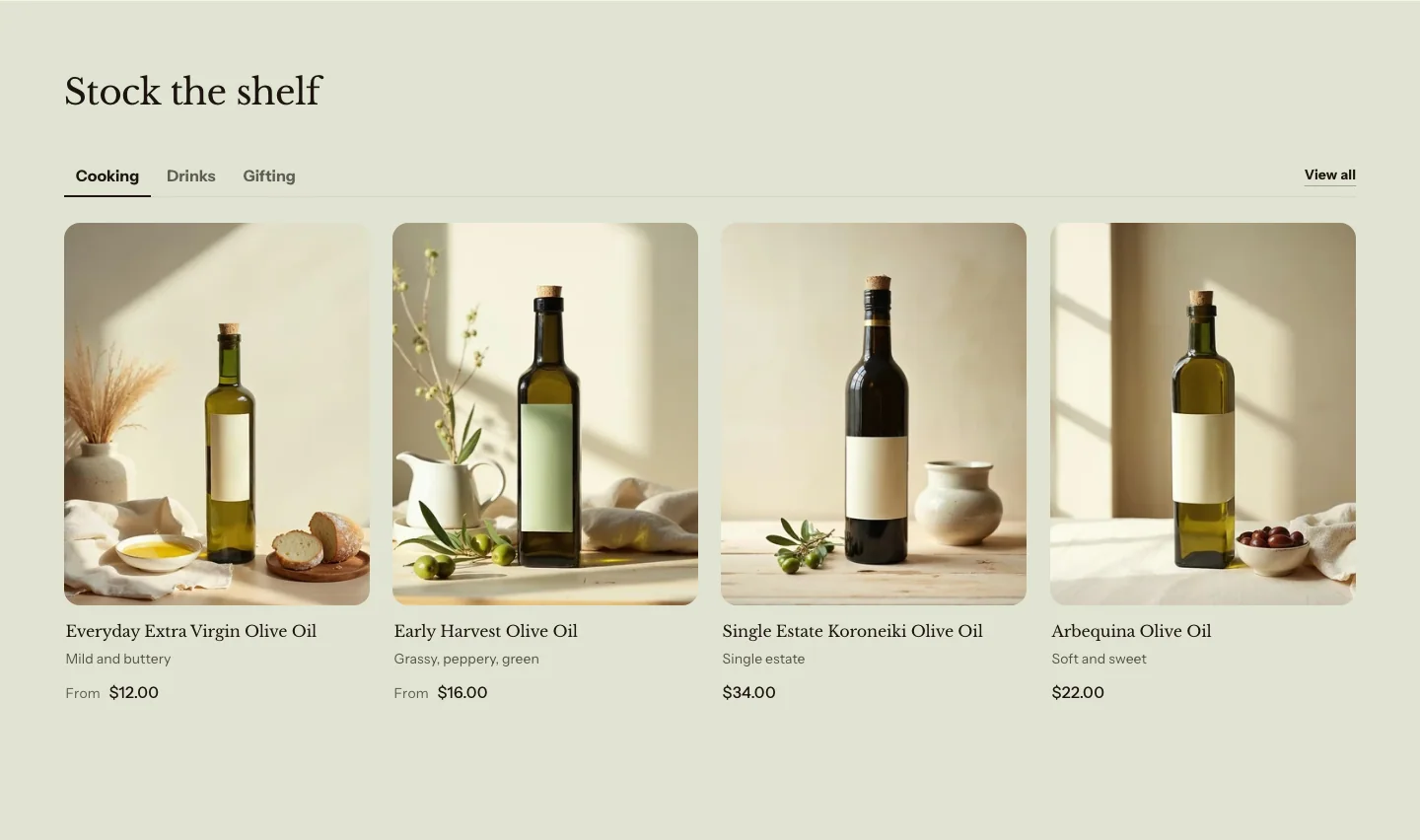
You can add these blocks:
- Collection tab
- Custom Liquid
- App blocks from apps you install
Each Collection tab block is one tab. The settings for the row of products, such as the layout and the number of products, are on the section and apply to every tab.
Settings
Layout
- Layout: Grid shows the products in rows. Carousel shows them in one row that customers swipe, or drag with a mouse.
- Products to show: The most products that each tab shows.
- Columns on desktop: How many products sit side by side on large screens. On smaller screens, the row holds at most three, and on phones it follows Columns on mobile. A tab with fewer products than columns uses fewer, wider columns, down to three.
- Columns on mobile: How many products sit side by side on phones.
- Show arrows: Shows previous and next buttons on the carousel. The buttons show only when there are more products than fit in view.
- Show view all link: Adds a View all link to each tab, which goes to the tab's collection.
- View all text: The words on the View all link. Leave it blank to use View all in the customer's language.
Section style
- Color scheme: The section's colors.
- Vertical padding: The space above and below the section.
Collection tab settings
- Collection: The collection whose products show in this tab.
- Heading: Leave blank to use the collection's title.
Featured collection
A featured collection shows products from one collection, in a grid or a carousel. Use it for a row of bestsellers or new arrivals on your home page.
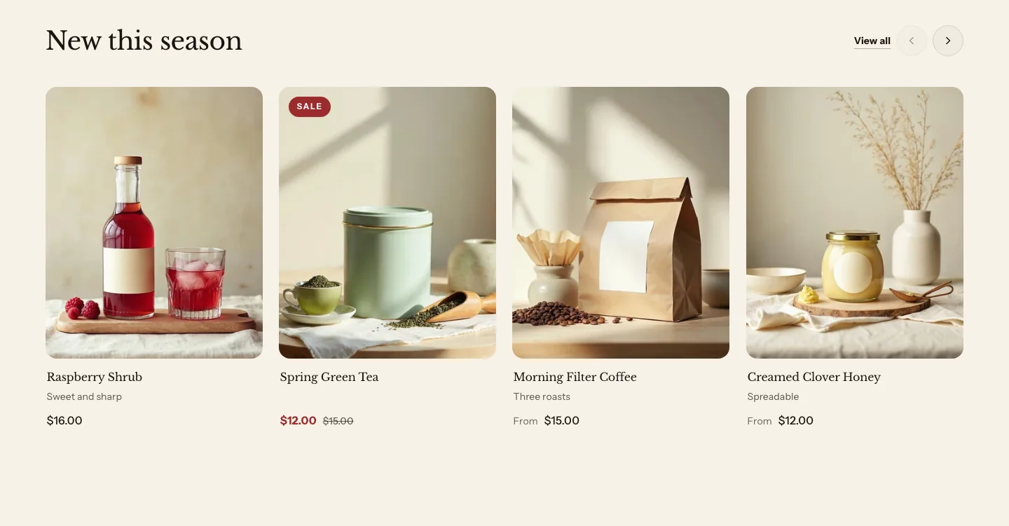
You can add these blocks under the products:
- Custom Liquid
- App blocks from apps you install
The section’s heading is in its Section header. Click it under the section in the sidebar to change it. The layout, the number of products and the columns are settings of the section itself, with the look of its product cards under Product cards.
A shelf with fewer products than columns uses fewer, wider columns, but never fewer than three. With three products and Columns on desktop set to 4, the three products share the row. Two products fill two thirds of it.
Settings
These settings apply to every featured collection, including a product set.
- Products from: Where the products come from. Collection shows products from one collection, in the collection's sort order. Chosen products shows the products that you pick, in your order.
- Collection: Used when products come from a collection.
- Products: Used with chosen products, up to 12.
- Show view all link: Adds a View all link at the end of the header row, to the collection. It's available when the products come from a collection.
- View all text: The words on the View all link. Leave it blank to use View all in the customer's language.
Layout
- Layout: Grid shows the products in rows. Carousel shows them in one row that customers swipe, or drag with a mouse.
- Products to show: The most products that the section shows.
- Columns on desktop: How many products sit side by side on large screens. A shelf with fewer products than columns uses fewer, wider columns, down to three.
- Columns on mobile: How many products sit side by side on phones.
- Show arrows: Shows previous and next buttons on the carousel. The buttons show only when there are more products than fit in view.
Product cards
- Image shape: The shape of the product images in this section. Same as theme settings uses the shape from the Product cards theme settings.
- Quick add: Overrides the theme setting for this section only.
Section style
- Color scheme: The section's colors.
- Vertical padding: The space above and below the section.
Product set
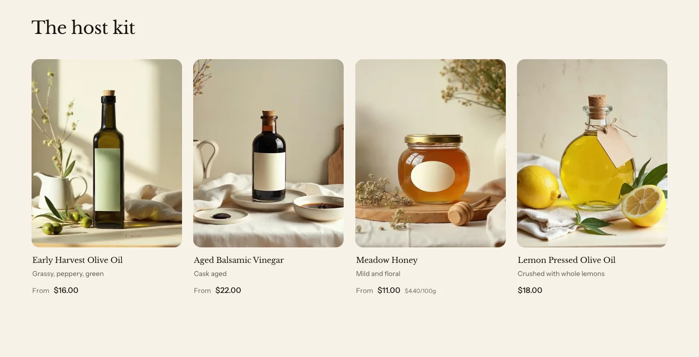
A product set is a featured collection set to Chosen products. Pick up to 12 products by hand, such as the pieces of a gift box or the ingredients for one recipe. Products show in the order that you pick them. To make one, add a Featured collection, set Products from to Chosen products, and then pick the products in Products.
Featured product
A featured product shows one product with its images, price, options and an add to cart button, on any page except a product page. Customers can choose options and add it to their cart without leaving the page. Use it to put a seasonal product or a gift on your home page.
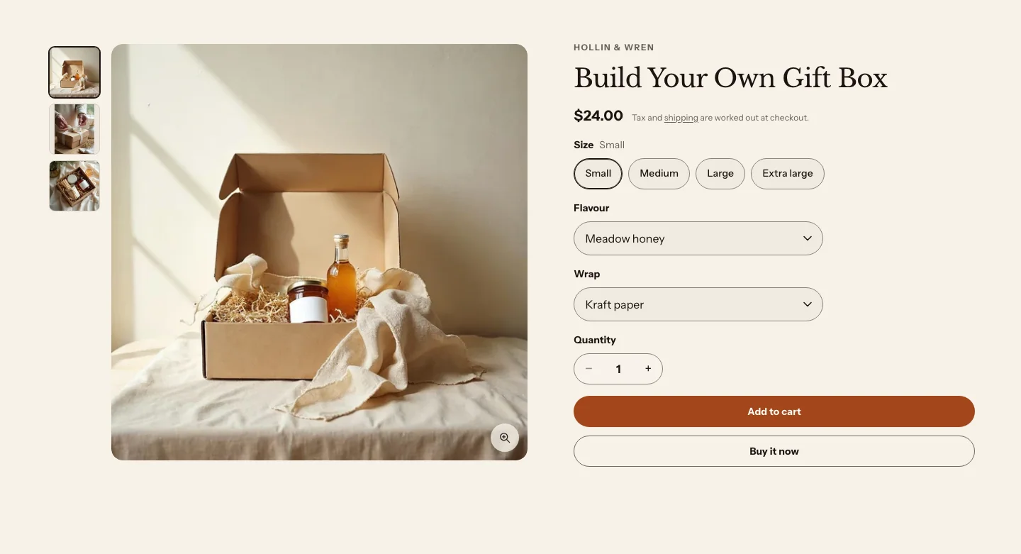
You can add these blocks:
- Theme blocks, such as Heading, Text, Button and Image
- App blocks from apps you install
- Product options
- Purchase form
The featured product uses the same blocks as a product page, so you can add the product information that you need, such as the description or stock level, in any order. Learn about each block in Product information blocks.
Settings
- Product: The product to show. Choose one with a clear title, price, description and images. Leave it blank and the section shows an available product from past the first eight in your catalog, one with several images when it can, so a new section is never empty and does not repeat the first cards of a product shelf beside it. A store with eight products or fewer shows the last available of them. A store with no products shows nothing to customers.
Layout
- Image position: Which side the product's images sit on, on large screens. On phones, the images sit above the product information.
- Image width: How much of the row the images take on large screens.
Subscriptions
- Preselect: Which purchase option is selected when the page loads, for a product that you sell as a subscription. It works only for products with plans from a subscription app, and has no effect on other products.
Section style
- Color scheme: The section's colors.
- Vertical padding: The space above and below the section.
Recently viewed
Recently viewed shows the products that a customer looked at on your online store, newest first. Use it on product pages or the cart page, so customers can get back to something they saw earlier.
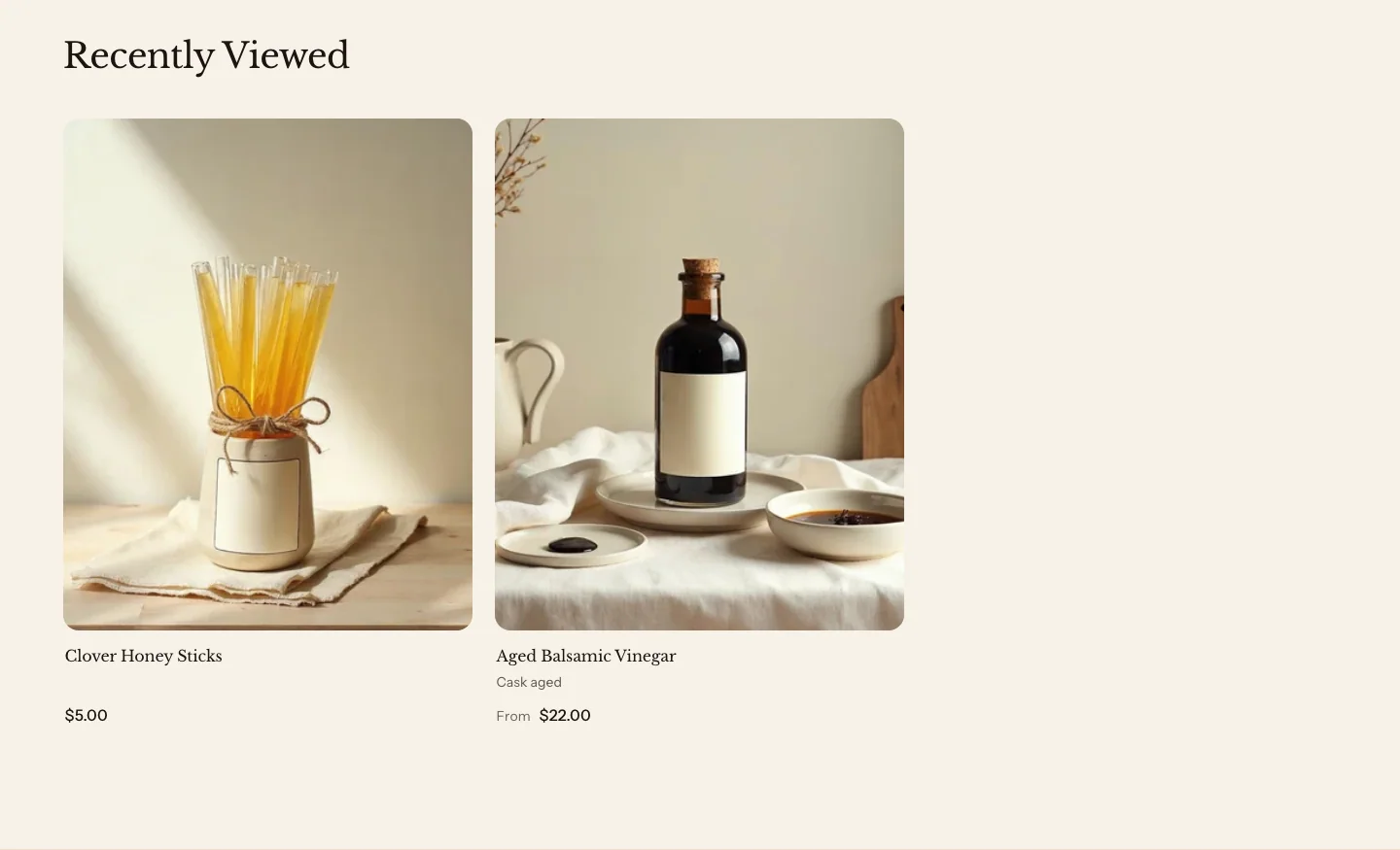
You can add these blocks under the products:
- Custom Liquid
- App blocks from apps you install
The heading is in the section’s Section header. The layout, the number of products and the columns are settings of the section itself.
Settings
Layout
- Layout: Grid shows the products in rows. Carousel shows them in one row that customers swipe, or drag with a mouse.
- Products to show: The most products that the section shows.
- Columns on desktop: How many products sit side by side on large screens. A shelf with fewer products than columns uses fewer, wider columns, down to three.
- Columns on mobile: How many products sit side by side on phones.
- Show arrows: Shows previous and next buttons on the carousel. The buttons show only when there are more products than fit in view.
Product cards
- Image shape: The shape of the product images in this section. Same as theme settings uses the shape from the Product cards theme settings.
- Quick add: Overrides the theme setting for this section only.
Section style
- Color scheme: The section's colors.
- Vertical padding: The space above and below the section.
How recently viewed works:
- The list is saved in each customer’s own browser, and nothing is sent to your store. A customer on another device or browser starts with an empty list.
- Heirloom saves the list only when the customer’s privacy choices allow your store to save preferences.
- The list holds the last 12 products that a customer viewed. The section shows as many as Products to show allows, up to 10.
- On a product page, the product that the customer is viewing is left out.
- Customers who haven’t viewed any products yet, or who have JavaScript turned off, don’t see the section. In the theme editor, it shows sample cards instead.
Related products
Related products shows products that Shopify recommends for the product that a customer is viewing. Shopify chooses them automatically, unless you pick related products for that product in the Search & Discovery app. You can add this section only to product templates.
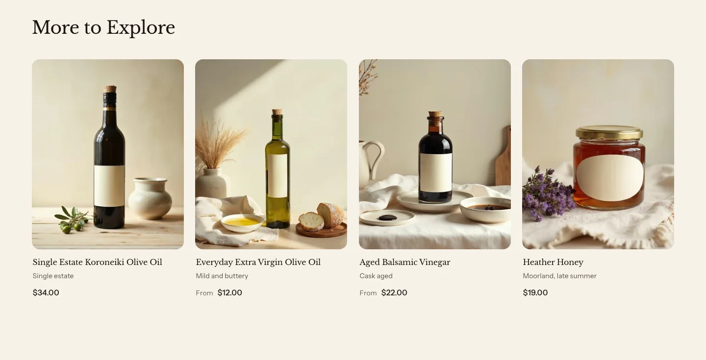
You can add these blocks under the products:
- Custom Liquid
- App blocks from apps you install
The heading is in the section’s Section header. The layout, the number of products and the columns are settings of the section itself. On the product page, Related products shows four products in four columns. The Larkspur theme style’s product page doesn’t include it, so add it yourself if you want it.
Settings
These settings apply to every related products section, including pairs well with.
- Recommendation type: Related products shows products similar to the one that the customer is viewing. Complementary products shows products that go with it, which you choose in the Search & Discovery app.
Layout
- Layout: Grid shows the products in rows. Carousel shows them in one row that customers swipe, or drag with a mouse.
- Products to show: The most products that the section shows.
- Columns on desktop: How many products sit side by side on large screens. A shelf with fewer products than columns uses fewer, wider columns, down to three.
- Columns on mobile: How many products sit side by side on phones.
- Show arrows: Shows previous and next buttons on the carousel. The buttons show only when there are more products than fit in view.
Product cards
- Image shape: The shape of the product images in this section. Same as theme settings uses the shape from the Product cards theme settings.
- Quick add: Overrides the theme setting for this section only.
Section style
- Color scheme: The section's colors.
- Vertical padding: The space above and below the section.
Pairs well with
Pairs well with is a related products section set to Complementary products. It shows the products that you’ve paired with each product in the Search & Discovery app, such as a jar of honey next to a cheese board. Products that have no pairings don’t show the section. It isn’t listed separately in the Add section list, so you add a Related products section and set Recommendation type to Complementary products.
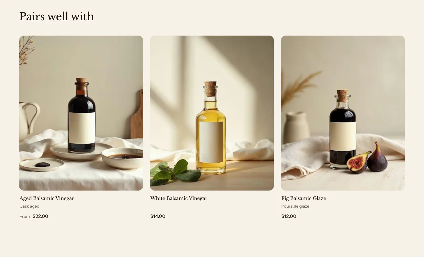
Steps:
- Install the Search & Discovery app from the Shopify App Store.
- In the app, add complementary products to each product that you want to pair.
- In the theme editor, open a product template, add a Related products section, and then set Recommendation type to Complementary products.
- Click Save.
Quick order list
A quick order list shows every variant of one product as a row with its own quantity field, so a customer can order several sizes or flavors at once. It’s made for wholesale and bulk orders. You can add it to any template and choose its product. It can’t go in the header or footer. On a product template, leave Product blank to list the product that the page shows.
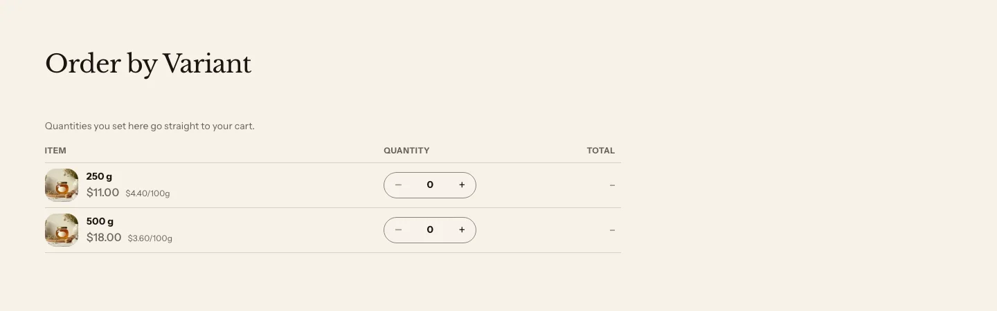
For a product with more than 12 variants, a search field above the list finds variants by title or SKU across every page of the list. Quantities save straight to the cart, and a note above the list says so. Both need JavaScript: without it, the search field doesn’t show and customers click Update cart to save their quantities.
Learn how it works, and about its settings, in Wholesale and B2B.
Related
- Learn more about product recommendations in Shopify’s Help Center.
- Learn more about product cards.
- Learn more about product pages.
- Learn more about collection list sections.