Header and announcement bar
The header sits at the top of every page of your online store. It holds your logo, your main menu, search, the customer account and the cart. Above it, the announcement bar shows short messages, such as a delivery cutoff or a seasonal offer.

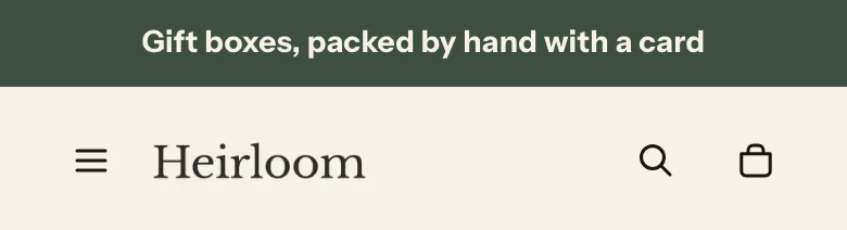
The header and the announcement bar are part of the header section group, so you edit them once and the change shows on every page.
Edit the header
Steps:
- From your Shopify admin, go to Online Store > Themes.
- Find Heirloom, and then click Edit theme.
- In the sidebar, under Header, click Header.
- Change the settings that you want.
- Click Save.
Menus
The header shows the menu that you pick in Main menu. You build the menu itself in your Shopify admin, and the theme draws it from the links and the way they’re nested.
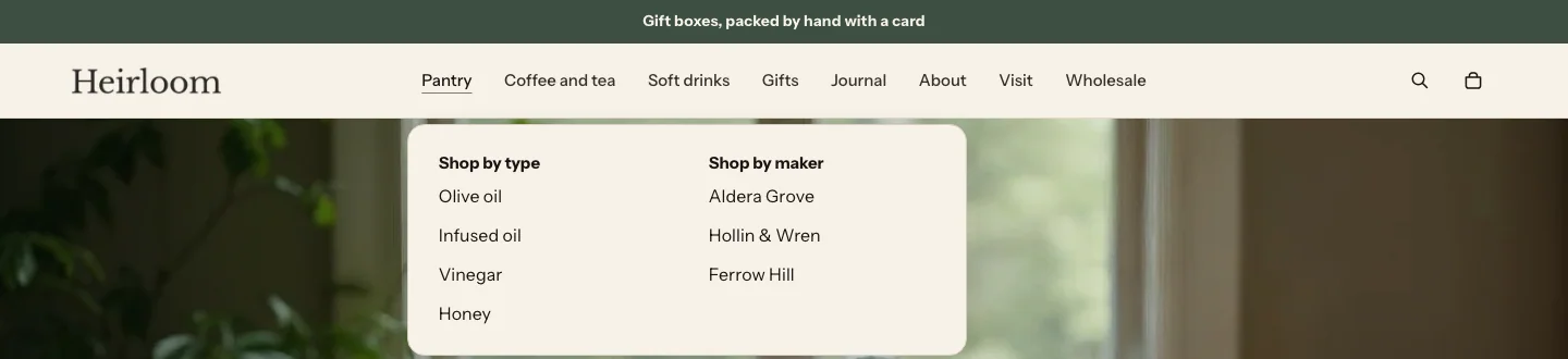
- A link with no links under it is a plain link.
- A link with links under it opens a dropdown or a mega menu when customers point to it or use the arrow button beside it.
- A dropdown is a compact list under the item. Links nested one level deeper show indented under their parent.
- A mega menu is a panel sized to what it holds. When the links under the top item have links of their own, each one becomes a column heading with its own list, such as a Pantry item with columns for oils, spices and preserves. Links under the top item that have no links of their own, such as All products, share one plain list in the first column, so the panel never shows an empty column or a heading with nothing under it. Mega menu columns sets how many columns fit across the panel before they wrap to a new row. A flat list of links fills down the panel, up to six links in each column.
Menu style decides which items open a mega menu. With Automatic, an item opens a mega menu only when its links have links of their own. Other items, including a plain list of links, open a compact dropdown. Menu links read in the body font. Pointing at a link draws a thin line under it, and the page that a customer is on keeps the line.
By default the menu shows the words as you typed them, in a medium weight. Menu text case, Menu text size and Menu text weight change that. The case also sets the headings in a mega menu.
Connect a menu
Steps:
- From your Shopify admin, go to Content > Menus, and then create or edit the menu that you want in the header. To make a dropdown, drag a menu item under another one.
- From your Shopify admin, go to Online Store > Themes.
- Find Heirloom, and then click Edit theme.
- In the sidebar, click Header.
- Under Main menu, click Change, and then select your menu.
- Click Save.
Mega menu promos
A mega menu promo is a card with an image, a heading, text and a link, shown at the end of one item’s mega menu. Use it to point to a collection or a gift guide from the menu, such as a New season card in your Pantry menu.
Steps:
- In the theme editor sidebar, click Header.
- Click Add block, and then select Mega menu promo.
- In Menu item, enter the title of the main menu item whose mega menu should show the card, exactly as it appears in your menu.
- Add an image, a heading, text and a link.
- Click Save.
Promo settings
- Menu item: Title of a main menu item that opens a mega menu panel.
- Image: The card's image. It's decorative, so the heading or text names the card for screen readers.
- Heading: The card's heading.
- Text: A short line under the heading. It shows as plain text, without bold, italic or links.
- Link: Where the card goes when a customer clicks it. The whole card is one link. When it's blank, the card goes to your all products collection.
An image-less promo card shows placeholder art in the theme editor only, not on your online store.
Header settings

You can add these blocks:
- Mega menu promo
- Custom Liquid
- App blocks from apps you install
- Main menu: Supports nested dropdown menus up to three levels.
Navigation
- Menu style: Which items open a mega menu. Automatic opens a mega menu for an item whose links have links of their own, and a compact dropdown for a plain list. Dropdown always opens a dropdown list. Mega menu opens a mega menu for every item that has links under it.
- Mega menu columns: How many columns to split child links into on desktop.
- Show dropdown chevrons: Shows a small arrow beside each menu item that opens a dropdown or a mega menu. It's off by default. When it's off, the arrow stays hidden on screens with a mouse until a keyboard user moves focus to it, so the menu still opens from the keyboard. On touch screens the arrow always shows.
Menu text
- Menu text case: As typed shows each menu link the way you wrote it in your menu. Uppercase turns the links, and the headings in a mega menu, into capitals with a little extra space between the letters. As typed is the default.
- Menu text size: How large the links in the header bar are. Small is 13 pixels, Medium is 15 and Large is 18. The menu on phones and tablets keeps its own size, with its top links at 18 pixels.
- Menu text weight: Regular uses the weight of your body font. Medium and Bold are heavier. If your font has no Medium or Bold weight, the menu shows the nearest weight it has.
Layout
- Logo position: Left puts the logo first and the menu after it. Center, menu beside puts the logo in the middle, with the menu on one side and the icons on the other. Center, menu below puts the logo and icons on the first row and centers the menu on a row of its own. On phones and tablets, a centered logo sits between the menu button and the icons.
- Show initials beside the store name: Without a logo, adds a circle with the first two letters of your store name beside it. It's off by default, so your store name shows on its own. It appears only while Theme settings > Brand has no logo.
Behavior
- Sticky header: Keeps the header in view while shoppers scroll.
- Transparent over first section: Lets the header lie over the first section of the page, on a soft shade that keeps the menu readable, and turns it solid as customers scroll. It's off by default. It works when the first section on the page is a Media banner or a Slideshow. Learn more in Transparent header.
- Text over the first section: The color of the logo, menu and icons while the header is over the first section. Pick Dark over light images and Light over dark ones.
- Logo over first section: An optional version of your logo that reads well over the image, such as a white one. It replaces the logo only while the header is transparent. When it's blank, the main logo shows.
- Show search: Shows search in the header.
- Search field: Icon that opens a bar shows a search icon that opens a search field under the header. Always visible on large screens shows the search field in the header on screens 990 pixels wide or wider, and the icon on smaller screens.
Icons
- Show account icon: Shows the account icon. It appears only when customer accounts are turned on for your store, so turning this on has no effect until they are.
- Cart icon: The picture on the cart link: a Bag, a Cart or a Basket.
- Cart count: Number in a circle shows how many items are in the cart. Dot shows a small dot, without a number, once the cart has items. Hidden shows no count.
Country and language
- Show country selector: Lets customers choose their country from the header. This appears when Show country and language in the header is on in Theme settings > Store features, and the store sells in more than one country.
- Show currency with each country: Adds the currency, such as USD $, after each country name. It's off by default, so the selector stays short.
- Show language selector: Lets customers choose their language from the header. This appears when Show country and language in the header is on in Theme settings > Store features, and the store has more than one language.
Section style
- Color scheme: The header's colors. The menu panels and the mobile menu use the same scheme.
Transparent header
With Transparent over first section on, the header lies over the top of the first section instead of above it. Use it when your home page opens with a large photo, so the photo reaches the top of the screen.
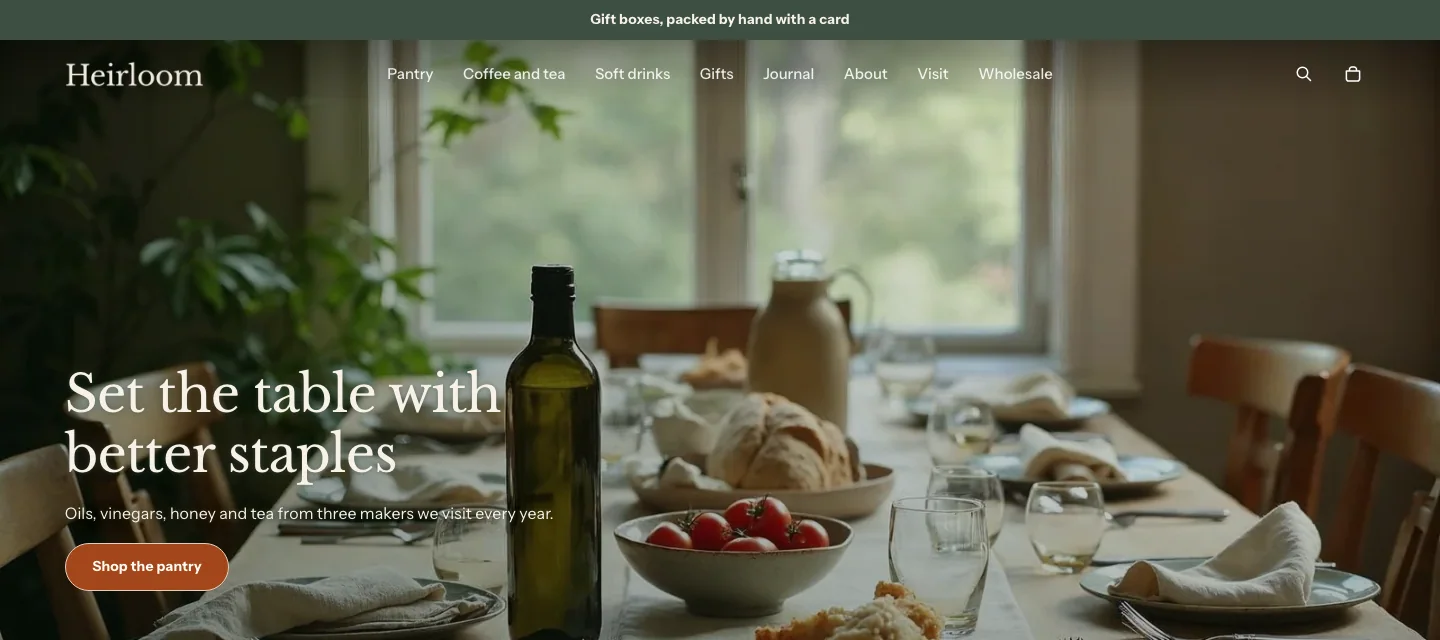
Steps:
- In the theme editor sidebar, under Header, click Header.
- Check Transparent over first section.
- Under Text over the first section, select Light for a dark image or Dark for a light one.
- Optional: under Logo over first section, select a version of your logo that reads over the image.
- Click Save.
The header turns solid when customers scroll, and while the phone menu, a menu panel or the search bar is open or has focus. It works when the first section on the page is a Media banner or a Slideshow. On any other page the header stays solid. The banner keeps its height, and its content clears the header. Without JavaScript the header stays solid.
Logo, account and other header items
Some of what the header shows comes from theme settings, so it’s the same in every place the theme uses it:
- The logo and its width come from Theme settings > Brand. A tall logo is held to a capped height, so it never makes the header too deep. Without a logo, the header shows your store name in your heading font, sized to fit on one line on a phone. A very long name wraps onto a second line instead of being cut short. Logo over first section in the header’s own settings replaces the logo while the header is transparent.
- Show country and language in the header and Show Follow on Shop in the header are in Theme settings > Store features. Once the country and language switch is on, the header’s own Show country selector, Show language selector and Show currency with each country settings choose what it holds. The Update button appears only after a customer picks a different country or language.
- The account icon shows when customer accounts are turned on, and Show account icon in the header’s own settings can hide it. The links in the account menu come from Customer account menu in Theme settings > Store features.
- Customers who buy for a company can switch between their company locations from the header. Learn more in Wholesale and B2B.
- The cart opens a cart drawer or goes to the cart page, depending on Cart type in Theme settings > Cart.
On phones and tablets
On screens narrower than 990 pixels, the main menu moves into a drawer that opens from the menu button. Customers tap a link to go to its page, or tap the arrow beside it to show the links under it. While the drawer is open, keyboard focus stays inside it, and closing it returns focus to the menu button.
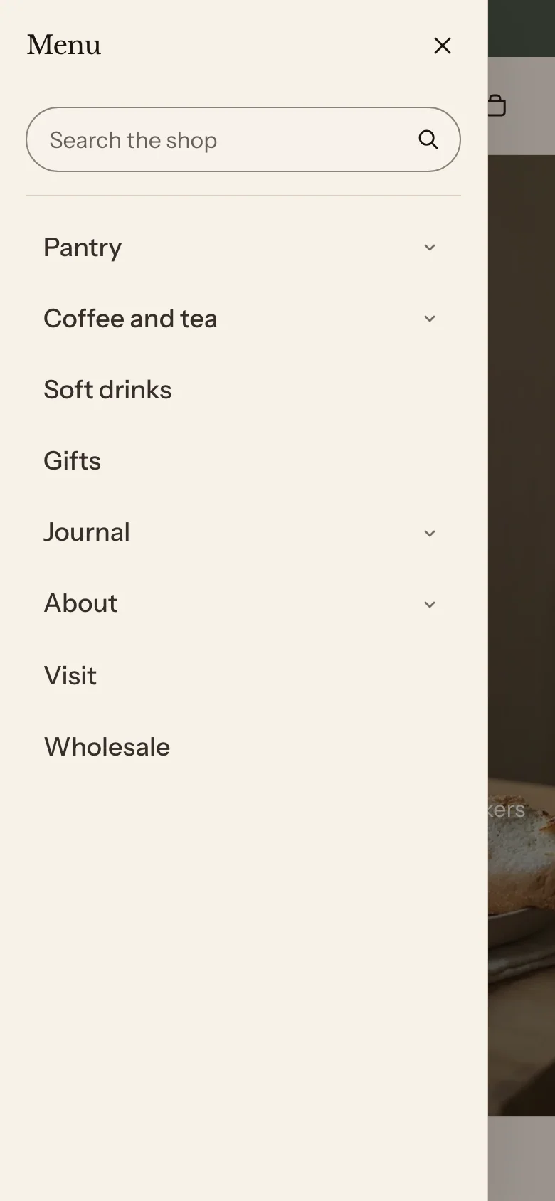
The drawer starts with a search field, so typing opens quick results on screen. Its top items are the largest text, then group labels and links that have no links of their own, then the links under a group, and each level is indented. The drawer also holds the company location picker for B2B customers, and the country and language selectors when Show country and language in the header is on.
Announcement bar
The announcement bar shows short messages above the header. One message stays still. With two or more, the bar shows them one at a time, with an arrow on each side of the message, and customers can step through them with the arrows or by swiping. If you turn on Allow customers to dismiss, a close button sits at the far end of the bar.

By default the bar has one message, Autoplay is off and customers can’t close it.
You can add these blocks:
- Announcement
Add an announcement
Steps:
- In the theme editor sidebar, under Header, click Announcement bar.
- Click Add block, and then select Announcement.
- Enter the text, and add a link if you want the message to go somewhere.
- Click Save.
Settings
Behavior
- Autoplay: Moves to the next message on its own. It's off by default. A pause button shows while autoplay is on. With autoplay off, the arrows always show on every screen size, so customers can reach every message.
- Change every: How many seconds each message shows when Autoplay is on.
- Show arrows: Shows previous and next buttons while Autoplay is on, on screens 750 pixels wide or wider. On smaller screens, customers swipe between messages. This setting appears only when Autoplay is on.
- Allow customers to dismiss: Adds a close button at the far end of the bar. It's off by default, because a closed bar hides what it says, such as a shipping date. Once a customer closes it, it stays closed until they close the browser tab.
Section style
- Color scheme: The bar's colors.
Announcement settings
- Text: The message. Keep it to one short line, so it fits on a phone.
- Link: Where the message goes when a customer clicks it. With a link, the whole message is one link, and bold or italic formatting in the text isn't shown.
The bar pauses while a customer’s pointer or keyboard focus is inside it, while it’s scrolled out of view and while the browser tab is in the background. Customers who set their device to reduce motion see it paused. When a customer closes the bar, it stays closed until they close the browser tab. The theme editor always shows the bar, even after you close it.
Related
- Learn more about menus in Shopify’s Help Center.
- Learn more about your logo and brand settings.
- Learn more about the footer.
- Learn more about search.