Storytelling
Storytelling sections tell customers who you are and how you work: a photo of your kitchen beside a few lines about it, the steps from order to doorstep, your latest blog posts or a few image tiles that lead into your collections. You find them under Storytelling in the Add section list.
Add a storytelling section
Steps:
- From your Shopify admin, go to Online Store > Themes.
- Find Heirloom, and then click Edit theme.
- Open the template that you want to change, and then click Add section.
- Under Storytelling, select a section.
- Click Save.
Before and after
Before and after shows two images of the same subject in one frame, with a slider that customers drag to compare them. They can also move the slider with the arrow keys. Use it for plating, packing or a pantry shelf, before and after.
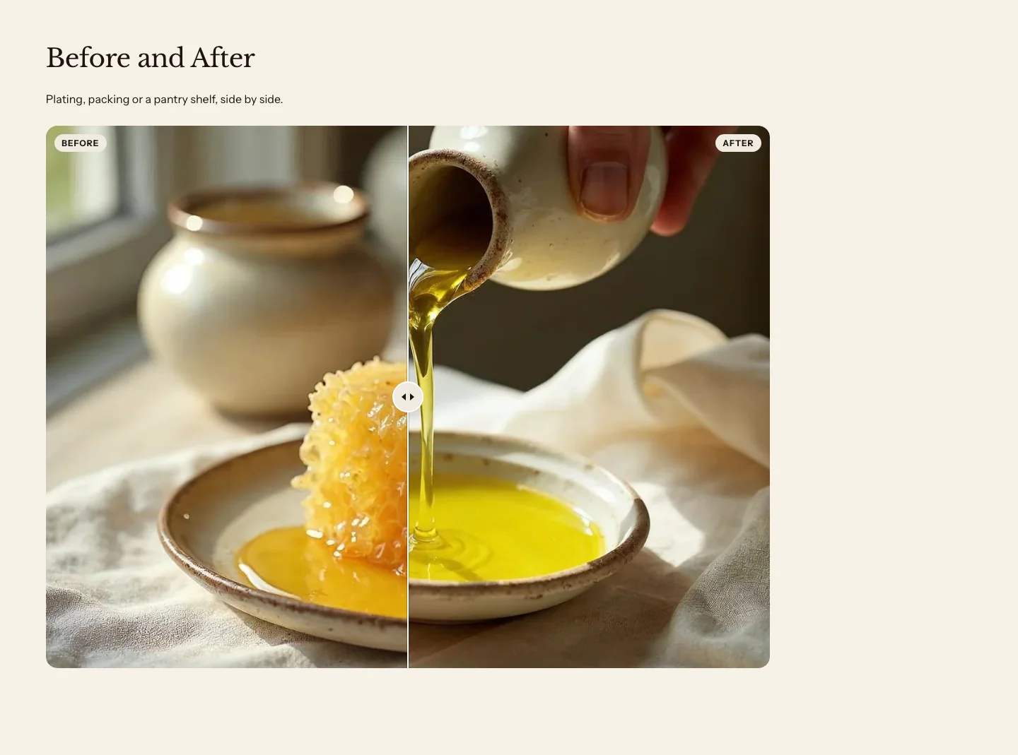
The section is a version of the Custom section, set up with a Heading, a Text and a Before and after block. Add your two images in the Before and after block. Learn about the block in Before and after, and about the section’s settings in Blank section.
Featured blog
A featured blog shows your latest blog posts as cards, each with an image, a title, a date and a short excerpt. Use it on your home page to point to your recipes, producer stories or news.
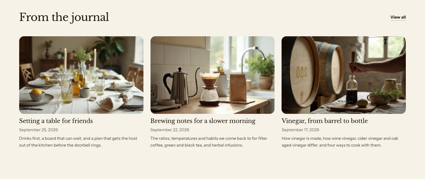
You can add these blocks under the cards:
- Custom Liquid
- App blocks from apps you install
The section’s heading is in its Section header. Click Section header under the section in the sidebar to change it.
Settings
- Blog: Blank shows the current blog on articles and the News blog elsewhere.
- Articles: Chosen articles replace the latest ones, in your order, up to Articles to show.
- Articles to show: The most posts that the section shows.
- Show view all link: Adds a View all link to the blog, in the header. Turn it off if you add your own button. View all text renames it, and a blank one uses the words in each customer's language.
- View all text: Leave blank to use View all in the shopper's language.
Layout
- Layout: Grid shows the posts as equal cards, with their titles, dates and excerpts lined up across each row. Featured and list shows the first post large, with the rest as a list beside it, or under it on narrow screens. With only one post to show, it looks like Grid.
- Columns on desktop: How many cards sit side by side on large screens, when Layout is Grid. On phones, the cards stack, and on tablets they sit two to a row.
Card content
- Show image: Shows each post's featured image.
- Show published date: Shows the date that each post was published.
- Show excerpt: Shows each post's excerpt, or the start of the post when it has no excerpt.
Section style
- Color scheme: The section's colors.
- Vertical padding: The space above and below the section.
Media with text
Media with text shows an image or a video beside a column of text. Use it to tell a short story, such as where your olive oil comes from, with a heading, a paragraph and a button. You find it under Media in the Add section list.
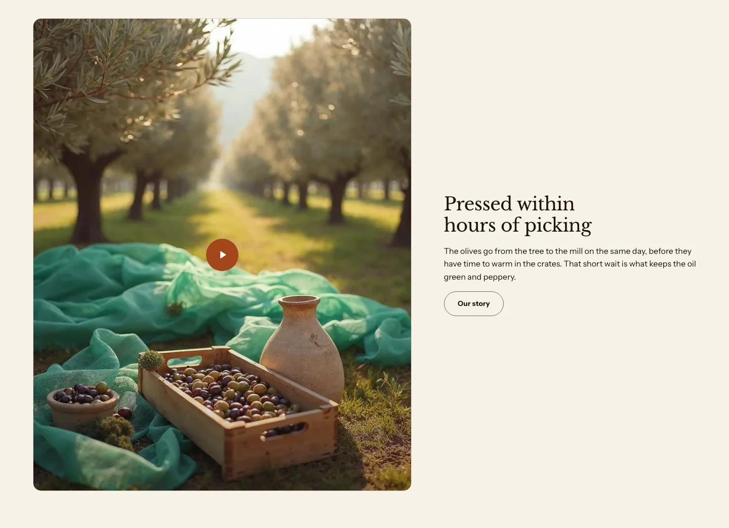
You can add these blocks:
- Theme blocks, such as Heading, Text, Button and Image
- App blocks from apps you install
The image or video is the section’s Media block. You can hide it, but you can’t remove it or move it. The text column takes any theme block, usually a Heading, a Text and a Button.
With no image or video, the text becomes a centered band at a reading width, the way Media banner looks with no media, so a colored section never leaves its right side empty. Alignment applies again once the section has an image or a video.
Settings
These settings apply to every media with text section, including the video with text and gift card layouts that follow.
Layout
- Image position: Which side the image or video sits on. On narrow screens, it always sits above the text.
- Image width: How much of the row the image or video takes.
- Vertical position: Where the text column sits, from top to bottom, next to the image.
- Alignment: How the text and buttons line up in their column, beside an image or a video. With no media the text is centered.
- Spacing: The space between the blocks in the text column.
Section style
- Color scheme: The section's colors.
- Vertical padding: The space above and below the section.
Media settings
- Image: The image. Set a focal point on it to control the crop.
- Video: A video from your Shopify files. It replaces the image, and plays when a customer presses play.
- YouTube or Vimeo link: A YouTube or Vimeo video, used when you haven't chosen a video from your files. It loads only when a customer presses play.
- Poster image: The still image that shows before a video plays. Without one, the section uses the image, and then the video's own preview image. A YouTube or Vimeo link with no poster and no image shows a plain frame with a play button.
- Autoplay: Plays a Shopify video on its own when it scrolls into view, muted, on a loop and without controls, with a pause button. It doesn't autoplay for customers who set their device to reduce motion, or when Enable motion is off in your theme settings.
- Image shape: The shape of the image or video frame. Original keeps the image's own shape.
Video with text
Video with text is a media with text section with a YouTube or Vimeo video in its Media block and a wide frame. Use it for a short film about your kitchen or your producers. To make one, add Media with text, and then in its Media block enter a link in YouTube or Vimeo link or choose a video from your Shopify files. For the wide frame, set Image shape to Wide (16:9).
Gift card
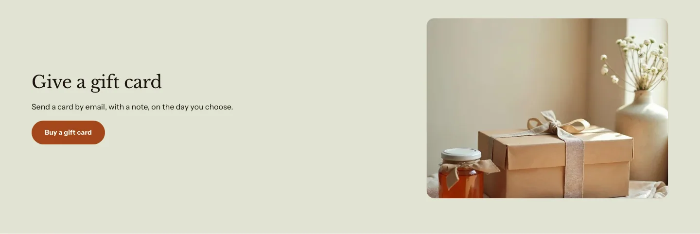
Gift card is a media with text section set up to promote your gift cards, with a small image on the right and a soft color scheme. Link its button to your gift card product, so customers go straight to it. To make one, add Media with text, set Image position to Right, Image width to Small and Color scheme to Soft.
Values
Values is a Columns section with a number, a heading and a short paragraph in each column. Use it to describe how you work, such as how you source, pack and serve. To make one, add Columns, set Numbering to Numbers, and remove the Image block from each column.
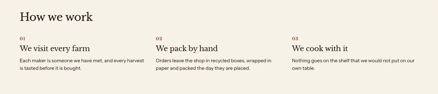
Learn about its settings in Columns.
Team
Team is a Columns section with a photo, a name and a role in each column, centered, two to a row on phones. To make one, add Columns, set Style to Plain, Alignment to Center and Columns on mobile to 2. Add a photo in each column’s Image block, the person’s name in the Heading block and their role in the Text block.
Learn about its settings in Columns.
Statistics
Statistics is a Columns section with a large number and a short label in each column, centered. To make one, add Columns, set Style to Plain and Alignment to Center, and remove the Image block from each column. Enter each number in the column’s Heading block, such as 120, and its label in the Text block, such as Producers.
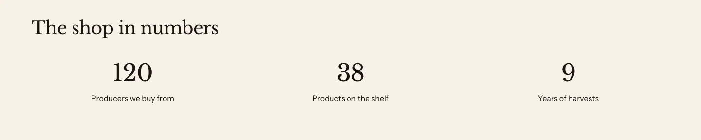
Learn about its settings in Columns.
Process steps
Process steps show the steps of a process in order, as a grid of numbered cards. Use them to explain how ordering, delivery or a subscription works, such as choose, pack and deliver.
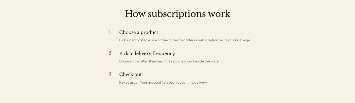
To build numbered steps on any page, add Columns and set Numbering to Numbers. The wholesale and subscriptions page templates come with a Process steps section that you can change like any other. Timeline in the Add section list adds the same section with Display set to Timeline.
You can add these blocks:
- Step
- Custom Liquid
- App blocks from apps you install
Each Step block is one step. The section’s heading is in its Section header.
Settings
These settings apply to process steps and the timeline, which are versions of the same section.
Layout
- Display: Steps shows the steps as cards in a grid. Timeline shows them in one column. With Marker set to Disc, or with dots, a line joins the markers.
- Numbering: What marks each step. Numbers counts the steps. Icons shows the icon that you choose in each step, and a step without an icon shows a dot. None shows no marker, and the timeline shows a plain dot.
- Marker: How a number or an icon is drawn. Plain, the default, shows the number or the icon on its own, in the accent color. Disc puts it on a tinted circle, and numbers it 01, 02, 03.
- Columns on desktop: How many steps sit side by side on large screens, when Display is Steps. On phones, the steps stack.
- Alignment: How the content lines up inside each step, when Display is Steps. In a timeline, Center moves the header and the whole timeline to the middle of the page, and the step text stays beside the line.
Section style
- Color scheme: The section's colors.
- Vertical padding: The space above and below the section.
Step settings
- Heading: The step's title.
- Text: A short description of the step.
- Icon: The icon that marks this step, when Numbering is Icons. Choose Custom image to use your own icon.
- Custom icon: Your own icon, when Icon is Custom image. Use a small, square image.
Timeline
A timeline is a process steps section with Display set to Timeline. The steps sit in one column. With Marker set to Disc, or with dots, a line joins the markers and each marker is centered on its step. With Plain numbers or icons, each marker sits beside its step’s heading, without a line. Use it for the history of your store or the seasons of a harvest. You add it as Timeline under Storytelling in the Add section list.
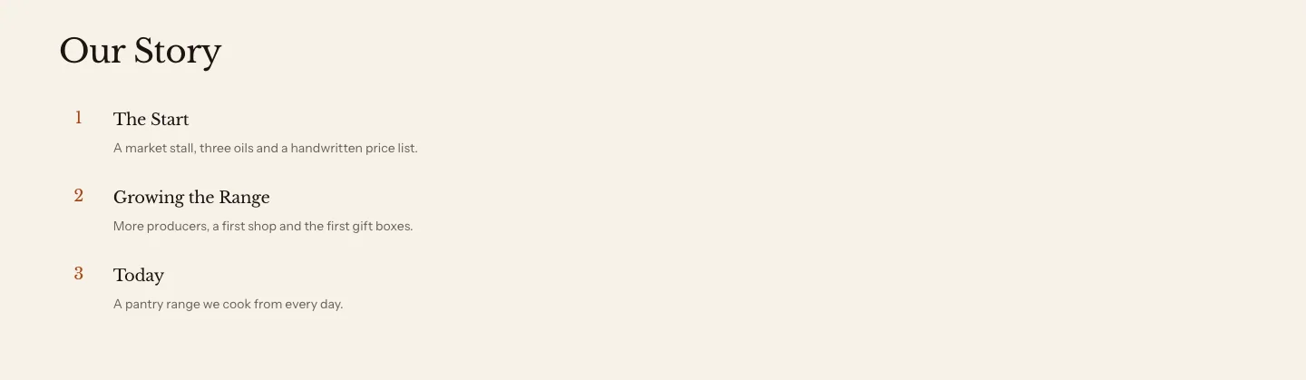
With Numbering set to Icons, each step shows its icon, or a dot when it has none. A new timeline starts with three sample steps. Replace them with your own. A step with a heading and no text shows greyed sample text in the theme editor only, so you can see the layout.
Promo tiles
Promo tiles are image tiles that each link to a product, a collection or a page, with a heading, text and a button. Use them to lead into your collections, such as a tile for Pantry and one for Gifts.
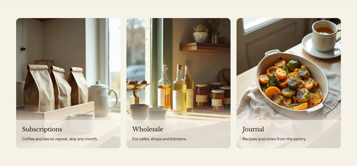
You can add these blocks:
- Promo tile
- Custom Liquid
- App blocks from apps you install
Each Promo tile block is one tile. The section’s heading is in its Section header.
Settings
These settings apply to every promo tiles section, including the split showcase and the collage.
Layout
- Display: Grid shows each tile as a card, with the image on top and the text below, unless Text is Over image. Mosaic packs the tiles together, with the text over the image.
- Columns on desktop: How many tiles sit side by side on large screens. On phones, grid tiles stack, and a mosaic has two columns.
- Image shape: The shape of each tile's image, when Display is Grid.
- Text: Where a grid tile's text sits. Below image puts the text under the image. Over image puts it over the image on a compact label, with a band of photo kept above it. It shows when Display is Grid.
- Height: The height of each row of tiles, when Display is Mosaic.
- Style: Card puts each grid tile on a panel with a thin border and rounded corners. Plain shows the tile on the section's background. When the text sits over an image, Card sets it on a solid label and Plain sets it on a soft wash that keeps the text readable on every color scheme.
Section style
- Color scheme: The section's colors.
- Vertical padding: The space above and below the section.
Promo tile settings
- Image: The tile's image. Leave it blank to use the product's or the collection's image.
- Link: Where the tile goes, when you haven't picked a product or collection. It comes before the product and collection pickers, and hides once you pick one.
Product or collection
- Product: A product or collection replaces Link. Without its own image, the tile shows the product's image. Without blocks, it shows the product's title.
- Collection: A collection that the tile links to, used when Product is blank.
- Size: How much room the tile takes in the mosaic. Wide spans two columns, Tall spans two rows and Large spans both.
- Overlay opacity: How strong the shade behind the tile's text is, when Style is Plain and the text sits over the image. Raise it if the text is hard to read over a busy photo.
Colors
- Use a different color scheme: Gives this tile its own color scheme instead of the section's.
- Color scheme: The tile's colors, when Use a different color scheme is on.
Split showcase
A split showcase is two promo tiles side by side, each with a landscape image above a heading, text and a button, without a panel. Use it to give two collections equal weight, such as Pantry and Bottles. To make one, add Promo tiles with two tiles, and set Image shape to Landscape (4:3) and Style to Plain.
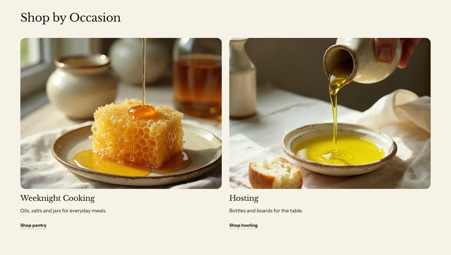
Collage
A collage is promo tiles with Display set to Mosaic: four image tiles packed together, each with a heading over the image. The first tile starts as Large and the last as Wide. Change a tile’s Size to rearrange them. You find it under Media in the Add section list. With Style set to Card, each label sits on a solid panel. With Plain, the label sits on a stronger wash of the color scheme, so the two styles look different and the text reads on every scheme.
Related
- Learn more about theme blocks.
- Learn more about blogs and recipes.
- Learn more about text sections.