Banners
Banner sections are the large, attention-getting bands of a page: a photo with a headline at the top of your home page, a rotating set of seasonal offers, or a slim band announcing a delivery cutoff. You find them under Banners in the Add section list.
Add a banner
Steps:
- From your Shopify admin, go to Online Store > Themes.
- Find Heirloom, and then click Edit theme.
- Open the template that you want to change, and then click Add section.
- Under Banners, select a banner.
- Click Save.
Media banner
A media banner shows one photo or video edge to edge, with a heading, text and buttons laid over it. Use it to open your home page with a hero shot, or to introduce a collection, such as a harvest-season olive oil. It’s listed as Media banner under Banners in the Add section list.
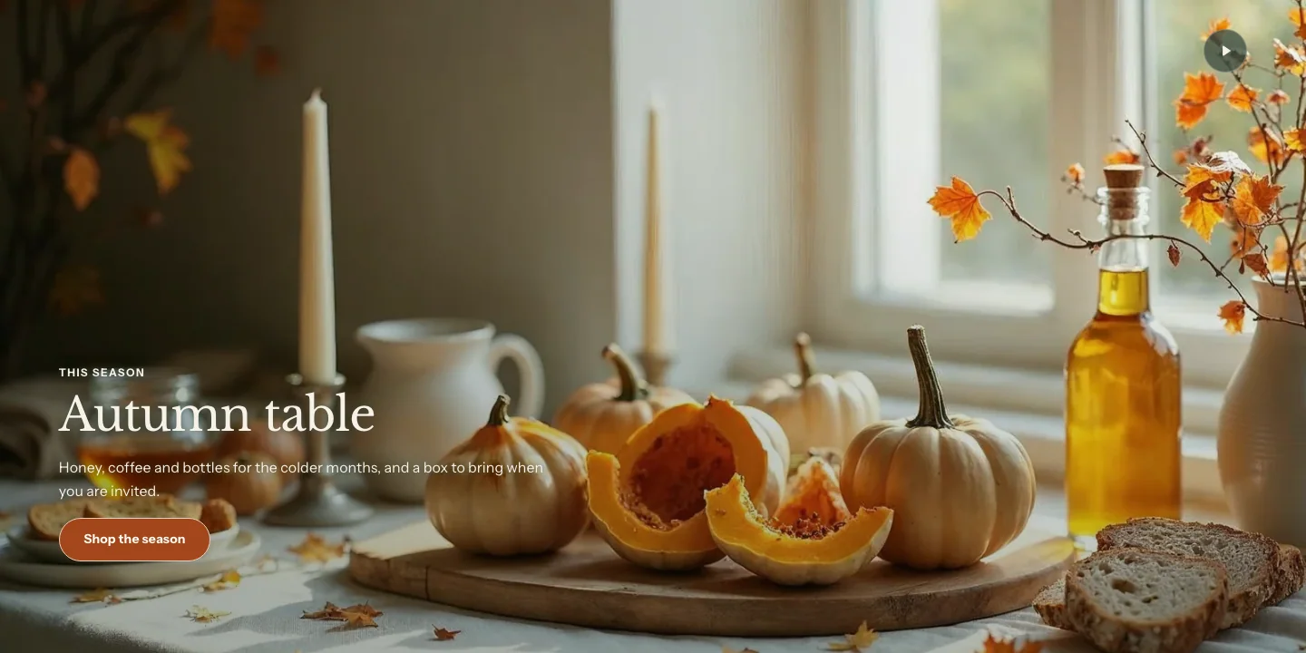
You can add these blocks:
- Theme blocks, such as Heading, Text, Button and Image
- App blocks from apps you install
The banner takes its colors from its color scheme. Over a photo, a wash of the scheme’s background color sits behind the text so it stays readable. A dark scheme gives you a dark hero, and a light scheme gives a pale, editorial look.
Settings
Media
- Image: The photo behind the banner. It fills the banner edge to edge and is cropped to fit, so set a focal point on the image to keep the important part in view.
- Mobile image: A different photo for phones, shown below 750 pixels wide. Use a portrait image so the subject isn't cropped on small screens.
- Video: A video from your Shopify files. It plays muted and on a loop behind the content, with a pause button. The image becomes the still that shows before it plays.
- YouTube or Vimeo link: A YouTube or Vimeo video. The banner shows the image with a play button, and the video opens over the banner when a customer presses play.
- Overlay opacity: How strong the color wash over the image or video is. Raise it if the text is hard to read over a busy photo.
- Video button: The pause button on a video from your Shopify files. Round is a button on a disc. Quiet is a small disc that stays easy to see over any footage but is less prominent. It shows only when a video is chosen.
Layout
- Height: The banner's minimum height. Small is 40% of the screen, Medium is 60%, Large is 80% and Full screen fills the whole first view. The Slideshow uses the same scale. When the banner is the first section on the page, Full screen ends exactly at the bottom of the first view, below the header and announcement bar. In any other place it is a full screen tall. The banner grows taller when its content needs more room. This setting shows once the banner has an image or video.
- Alignment: Where the content sits across the banner. This setting shows once the banner has an image or video.
- Vertical position: Where the content sits from top to bottom. This setting shows once the banner has an image or video.
- Content width: How wide the block of text can get. Narrow keeps paragraphs at a comfortable reading width and gives only the heading a little more room, so a long heading breaks into balanced lines.
Section style
- Color scheme: The colors of the text, buttons and wash.
Over the first section of a page, the banner can sit under a transparent header. Learn more in Transparent header.
Video banner
To make a video banner, add a Media banner and choose a video in Video, or enter a link in YouTube or Vimeo link. It has the same settings as any other media banner. Upload a short, silent loop for the best result. Customers who set their device to reduce motion see the still image instead, with a play button.
Slideshow
A slideshow shows up to six slides, one at a time. Each slide has its own image, mobile image, color scheme and blocks, so you can run a different offer on each one.
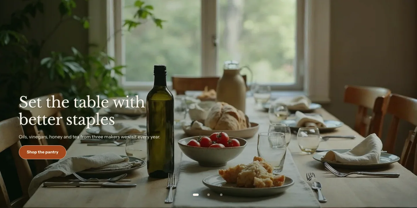
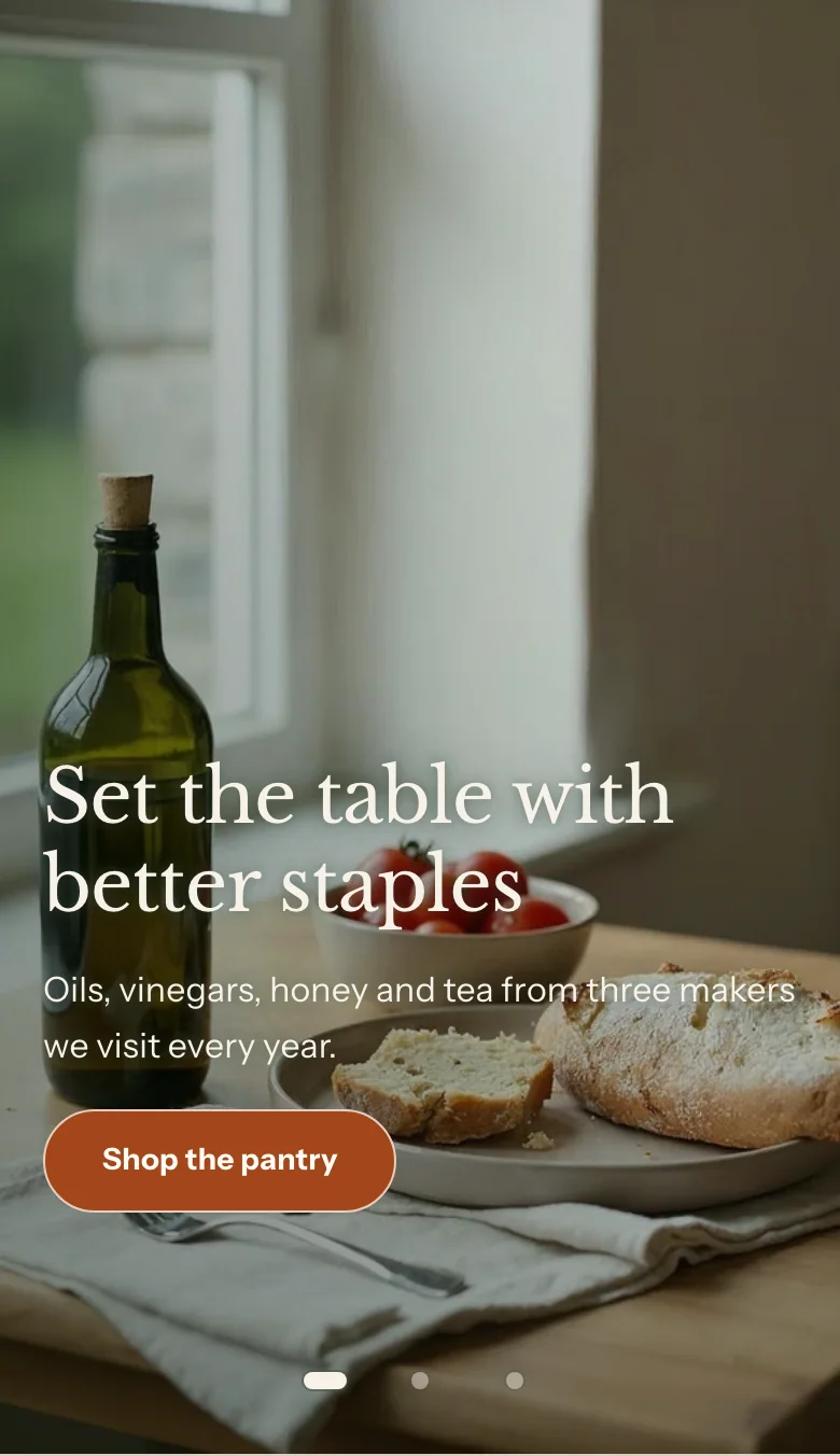
You can add these blocks to the slideshow:
- Slide
- Custom Liquid
- App blocks from apps you install
Customers swipe between slides, or use the arrow and dot buttons. When Autoplay is on, a pause button stays visible, and the slideshow also pauses while a customer’s pointer or keyboard focus is inside it. Customers who set their device to reduce motion see it paused.
Settings
Layout
- Height: The minimum height of every slide. Small is a slim band, 40% of the screen, with tighter room around the content. Medium is 60%, Large is 80% and Full screen fills the first view, and ends at the bottom of the first view when the slideshow is the first section on the page. The Media banner uses the same scale. A slide grows taller when its content needs more room. A slide with no image is a flat field in the slideshow's colors that fits its text, so a slideshow of such slides is a slim band.
Behavior
- Transition: How one slide gives way to the next. Slide moves across, and the speed is the browser's own. Fade dissolves one slide into the next. With Fade, customers still use the arrows, dots and a swipe, or the left and right arrow keys once the slides have keyboard focus. Customers who set their device to reduce motion see the slides swap with no fade.
- Fade speed: How long the fade takes, from 200 to 1,200 milliseconds. It shows only when Transition is Fade.
- Autoplay: Moves to the next slide on its own.
- Change every: How many seconds each slide shows when autoplay is on.
- Show arrows: Shows previous and next buttons beside the dots. It starts off, and it shows only when Show dots is on: with the dots off, the arrows always show, so customers can always change slides.
- Show dots: Shows one dot per slide, which customers can click to jump to a slide. Turn it off and the arrows show instead.
- Name for screen readers: Screen readers announce this name, or Slides when it is blank.
Section style
- Color scheme: The default colors of every slide. A slide can use a different scheme.
Slide settings
- Image: The slide's photo. Set a focal point to control the crop.
- Mobile image: A different photo for phones, shown below 750 pixels wide.
- Overlay opacity: How strong the color wash over the photo is.
- Alignment: Where the slide's content sits across the slide. This setting shows once the slide has an image. A slide with no image centers its content, and its buttons take the color scheme's usual button style.
- Vertical position: Where the slide's content sits from top to bottom. This setting shows once the slide has an image.
- Use a different color scheme: Gives this slide its own color scheme instead of the slideshow's.
- Color scheme: The slide's colors, when Use a different color scheme is on.
Promo banner
A promo banner is a band of color with a heading, text and buttons, without a photo. Use it for an offer, a new arrival or a sign-up call to action between other sections.
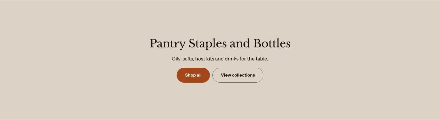
You can add these blocks:
- Theme blocks, such as Heading, Text, Button and Image
- App blocks from apps you install
- Heading
- Text
- Button
- Icon
- Countdown
Settings
These settings apply to every promo banner, including the shipping banner and the countdown that follow.
Layout
- Layout: Split puts buttons and a countdown at the end, or else the last block.
- Alignment: How the blocks line up when Layout is Stacked.
- Content width: How wide the content can get.
Section style
- Color scheme: The band's colors.
- Vertical padding: The space above and below the band.
With Layout set to Split, one action (a Button, a Group of buttons or a Countdown) sits in its own column at the end of the band, beside the other blocks. If the band has no button or countdown, the last block takes that place. With more than one action, such as a countdown and a button, the band stacks in one column, so put several buttons in one Group. On phones, and with fewer than two blocks, the band always stacks.
Shipping banner
A shipping banner is a promo banner with an icon, a heading, a line of text and a button, in a slim, split layout. Use it for delivery cutoffs, local pickup or a free-shipping threshold.

To make one, add a Promo banner, set Layout to Split, and add an Icon block, a Heading block, a Text block and a Button block. To put the icon beside the heading, place both in a Group with Direction set to Side by side.
Countdown
A countdown is a promo banner with a Countdown block that counts down to a date and time. Use it for a limited offer or a pre-order deadline. To make one, add a Promo banner, and then add a Countdown block to it.
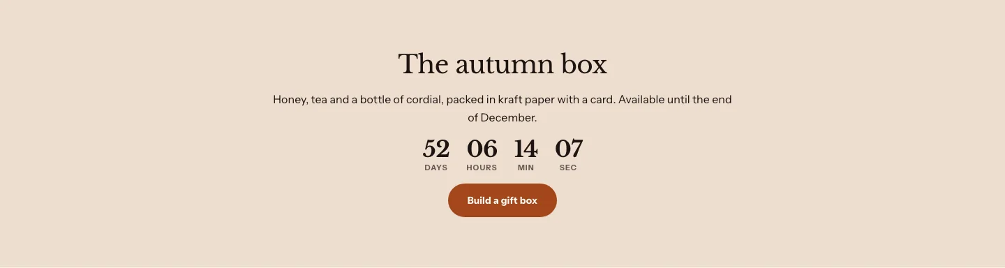
Countdown block settings
- End date and time: When the countdown ends, in your store's time. Type it as year, month, day and 24-hour time, such as 2026-12-31 18:00. A date written out, such as Dec 31 2026 6pm, also works. See the note below for time zones.
- Unit labels: Words puts Days, Hours, Min and Sec under the numbers. Letters puts one letter beside each number, a tighter clock for phones. In a language where two of the four names start with the same letter, such as German or Turkish, the countdown shows words instead.
- Unit style: Plain, the default, sets the numbers in large type with their names, and no boxes. Boxed puts each number on its own tile with a thin border.
- Hide when ended: Hides the countdown block once the end time passes.
- Message when ended: The message shown after the end time, when the countdown isn't hidden.
You can type a time zone after the end time. An offset such as +01:00 is used as typed. Common zone names are converted for you, such as PST, UTC, CET or AEST. Your store’s own zone name, such as EST in New York, is store time. A zone name that Heirloom doesn’t know is read as store time, and the theme editor shows a note under the countdown that the zone wasn’t read.
A date that isn’t on the calendar, such as 2026-02-30, can’t be read. The theme editor shows a warning that names the form to use, and your online store shows nothing, so a typo is never mistaken for a countdown that has ended. When you can, type the end as 2026-12-31 18:00.
Related
- Learn more about adding sections and blocks.
- Learn more about colors and color schemes.
- Learn more about theme blocks.