Media
Media sections show your photos and logos: a grid of images from your kitchen, a lookbook that links a photo to the products in it, or a moving band of short phrases. You find them under Media in the Add section list.
Add a media section
Steps:
- From your Shopify admin, go to Online Store > Themes.
- Find Heirloom, and then click Edit theme.
- Open the template that you want to change, and then click Add section.
- Under Media, select a section.
- Click Save.
Gallery
A gallery shows a set of images in a grid or a carousel, each with an optional caption and link. Use it for photos of your producers, your shop or a finished dish.
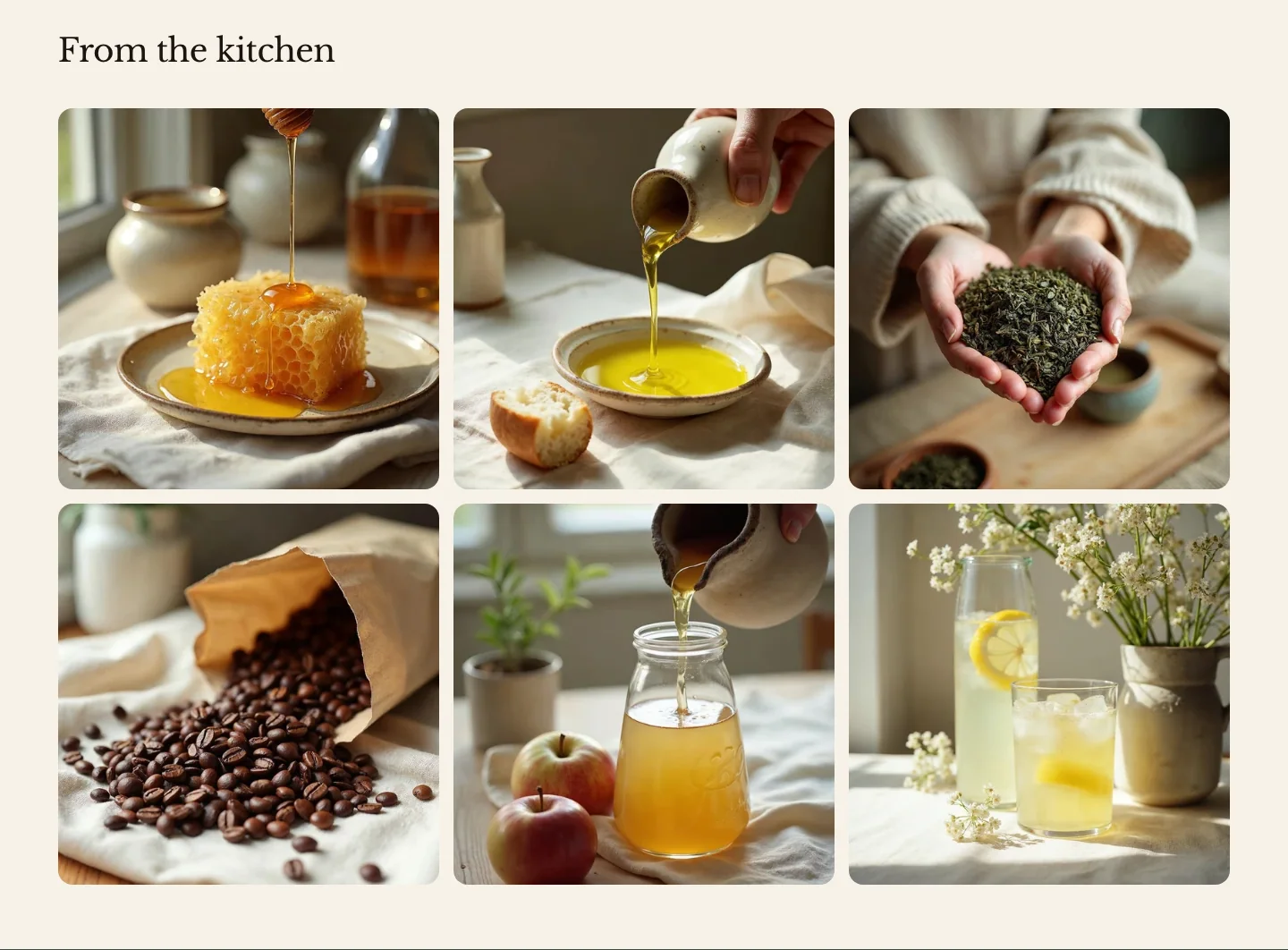
You can add these blocks:
- Gallery image
- Custom Liquid
- App blocks from apps you install
Add a heading above the images in the section’s Section header block. Each Gallery image block is one image.
- Grid places the images in rows. Phones show Columns on mobile, tablets show up to three columns, and wider screens show Columns on desktop.
- Carousel places the images in one row that customers swipe, or drag with a mouse. On phones, the next image peeks in from the edge. Previous and next buttons appear above the row when the images don’t all fit.
Settings
These settings apply to the gallery, the community grid, the dual image and the logo list, which are versions of the same section.
Layout
- Layout: How the images are arranged: in rows, or in one row that scrolls sideways.
- Columns on desktop: How many images sit side by side on large screens. In a carousel, this sets how many images are in view at once.
- Columns on mobile: How many images sit side by side on phones.
- Image shape: The shape of every image frame. Original keeps each image's own shape.
- Image fit: Crop to fill fills each frame and crops the edges. Show whole image fits the whole image inside the frame on a card background, which suits logos and product cutouts.
- Spacing: The space between images.
Section style
- Color scheme: The colors of the section, the captions and the arrows.
- Vertical padding: The space above and below the section.
Gallery image settings
- Image: The image. Set a focal point on the image to control how it's cropped. The image's alt text is used for customers who use screen readers.
- Caption: A short caption under the image.
- Link: Makes the whole image a link, for example to a collection or a blog post.
- Open in new tab: Opens the link in a new browser tab. A small arrow badge on the image shows customers that it opens a new tab.
Community grid
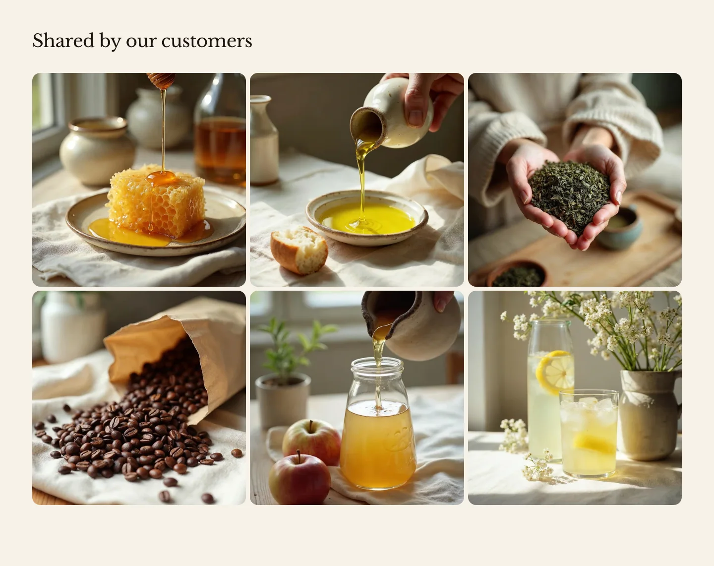
A community grid is a gallery for customer and partner photos: images in three columns, with small gaps and extra space above and below. Use it to share photos from your customers or your social media accounts. To make one, add a Gallery, set Columns on desktop to 3, Spacing to Small and Vertical padding to Large. It has the same settings as the gallery.
Dual image
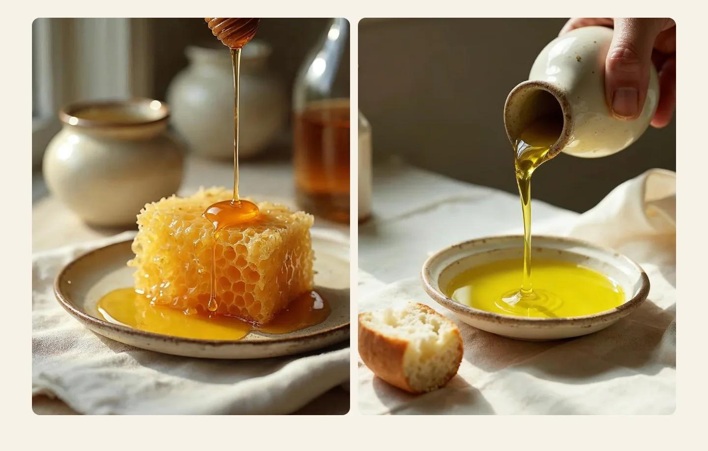
A dual image is a gallery with two portrait images side by side, stacked on phones. Use it to pair two photos, such as a field and the jar it ends up in. To make one, add a Gallery with two images, set Columns on desktop to 2, Columns on mobile to 1 and Image shape to Portrait (4:5). It has the same settings as the gallery.
Logo list
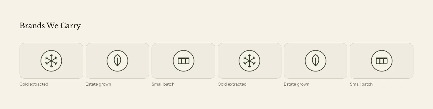
The logo list is a gallery set up for logos: six images across, with Image fit set to Show whole image so no logo is cropped. Use it for the farms you buy from, the awards you’ve won or the stockists that carry your products. Add a link to an image to send customers to that partner’s website.
Lookbook
A lookbook shows one large image with pins on it. Each pin marks a product in the photo. When a customer selects a pin, a card opens with the product’s image, title, price and a link to the product. Use it for a styled table or a pantry shelf, so customers can shop what they see.
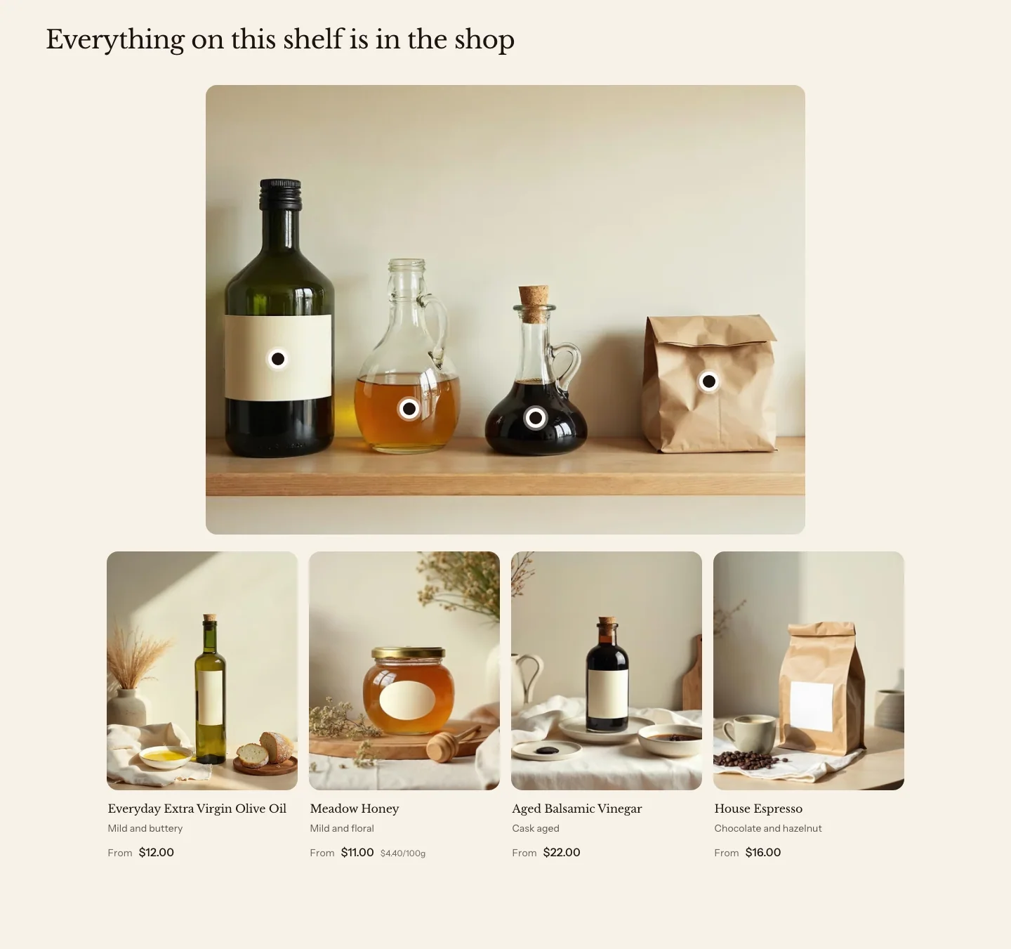
You can add these blocks:
- Hotspot
- Custom Liquid
- App blocks from apps you install
The products also show as a list of cards next to the image. With Products set to Beside image, the image sits beside the list on large screens, and above it on smaller screens. With Below image, the image is centered, at most about 640 pixels tall, over one centered row of cards, so a short list leaves no blank column. With no image, the list shows on its own.
Settings
Media
- Image: The photo the pins sit on.
- Image shape: The shape of the photo's frame. Original keeps the photo's own shape. With another shape, the photo is cropped to fit, so check that each pin still sits on its product.
- Products: Beside image puts the product cards in a column next to the photo. Below image puts them in a row under it. Below suits a wide photo or a short list of products.
Section style
- Color scheme: The colors of the section, the pins and the product cards.
- Vertical padding: The space above and below the section.
Hotspot settings
Each Hotspot block is one pin and one product card.
- Product: The product the pin links to. A hotspot with no product doesn't show.
- Horizontal position: How far across the image the pin sits, from the left edge (0%) to the right edge (100%).
- Vertical position: How far down the image the pin sits, from the top edge (0%) to the bottom edge (100%).
Marquee
A marquee is a band of short phrases that scrolls slowly across the page, each with an optional icon or logo. Use it for a line such as “Small batch, made by hand”, for delivery promises, or for the names of your producers.

You can add these blocks:
- Item
The phrases show in your body font as you typed them, in a medium weight. The band pauses while a customer points at it or moves keyboard focus into it, and a small pause button at the end of the band stops it for as long as the customer likes. Customers who set their device to reduce motion see the phrases still, wrapped onto lines and centered.
Settings
- Speed: How fast the band moves. Each band moves at about the same pace whatever the number of items.
- Direction: Which way the phrases move across the screen: Moves left or Moves right. In right-to-left languages the band mirrors, so it moves with the reading direction.
- Text style: The type of every phrase in the band. Body font shows the words as you typed them in your body font, Heading font shows them in your heading font at a larger size, and Uppercase shows them in small, all-capital letters with wide spacing.
Section style
- Color scheme: The colors of the band and its text.
- Vertical padding: The space above and below the band. The spacing is tighter than in other sections.
Item settings
- Text: The phrase. Keep it to a few words.
- Icon: An icon before the phrase, from Heirloom's icon library. Select Custom image to use your own image instead, such as a logo.
- Custom icon: The image used when Icon is Custom image.
Collage
The collage is a version of the promo tiles section set to a mosaic: linked image tiles of different sizes, packed together. It’s listed under Media, and its settings are described with the other promo tiles in Collage on the Storytelling page.
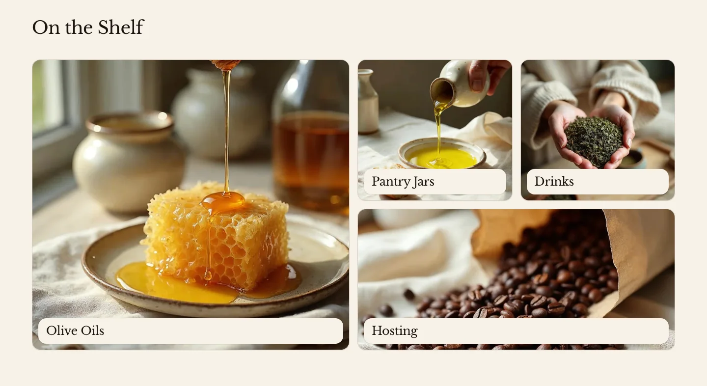
Empty image slots
In the theme editor, an empty image slot in a section, such as in Media with text, Gallery, Lookbook, Promo tiles or a menu promo, shows a light tint of the section’s color scheme with a plain image icon. It tells you to add an image, and it never looks like a dark photo or a video. Your online store doesn’t show these empty slots. A product, collection or article that has no image of its own shows a quiet image icon on your online store.
Related
- Learn more about adding sections and blocks.
- Learn more about colors and color schemes.
- Learn more about the Image and Video blocks.