Collections
The collection list shows the collections that you pick as cards, each with an image and a heading that link to the collection. Use it on your home page to help customers find their way in, such as cards for Pantry, Bottles, Gifts and Host kits. You find it under Collections in the Add section list.
To show the products of several collections in one section, use Collection tabs instead.
Add a collection list
Steps:
- From your Shopify admin, go to Online Store > Themes.
- Find Heirloom, and then click Edit theme.
- Open the template that you want to change, and then click Add section.
- Under Collections, select Collection list.
- In the sidebar, click each Collection block under the section, and then select a collection.
- Click Save.
Collection list
Each Collection block is one card. The settings that shape the cards, such as the image shape and where the text sits, are on the section and apply to every card.
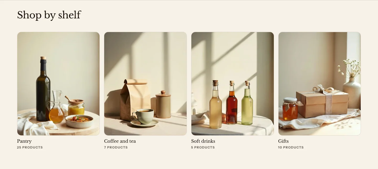
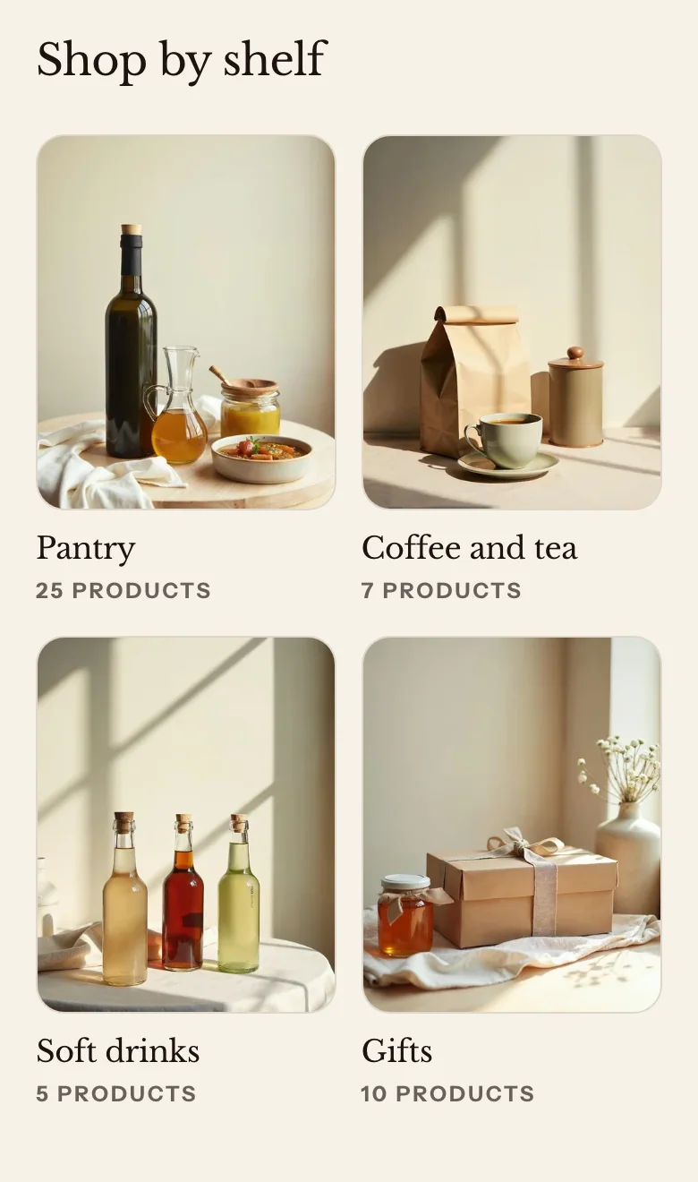
You can add these blocks:
- Collection
- Custom Liquid
- App blocks from apps you install
The section’s heading is in its Section header. Click Section header under the section in the sidebar to change it.
Settings
- Show view all link: Adds a View all link at the end of the header row, to the page that lists all your collections.
- View all text: Leave blank to use View all in the shopper's language.
Layout
- Layout: Grid shows the cards in rows. Carousel shows them in one row that customers swipe, or drag with a mouse.
- Columns on desktop: How many cards sit side by side on large screens. On tablets, the row holds up to three, and four columns become two.
- Columns on mobile: How many cards sit side by side on phones.
- Show arrows: Shows previous and next buttons on the carousel. The buttons show only when there are more cards than fit in view.
Card content
- Image shape: The shape of every card's image. Original keeps each image's own shape. Circle crops each image to a circle.
- Text position: Below image puts the heading and text under the image. Over image puts them over the bottom of the image, in light text on a dark shade so they stay readable on any photo.
- Show product count: Shows how many products are in each collection.
- Show excerpt: When a card's Text is blank, shows the first words of the collection's description.
Section style
- Color scheme: The section's colors.
- Vertical padding: The space above and below the section.
Collection settings
- Collection: The collection that the card links to.
- Image: The card's image. Leave it blank to use the collection's own image.
- Heading: Leave blank to use the collection's title.
- Text: A short line under the heading. Leave it blank to use the start of the collection's description, when Show excerpt is on.
Related
- Learn more about creating collections in Shopify’s Help Center.
- Learn more about collection pages.
- Learn more about product sections.