Layout and apps
Layout sections are the open containers of Heirloom. Build a section of your own from theme blocks, add space or a line between sections, give an app a full-width place on the page, or add your own code. You find them under Layout in the Add section list.
Add a layout section
Steps:
- From your Shopify admin, go to Online Store > Themes.
- Find Heirloom, and then click Edit theme.
- Open the template that you want to change, and then click Add section.
- Under Layout, select a section.
- Click Save.
Blank section
A blank section is a custom section with no blocks. Add the blocks you need, such as a heading, an image, a quote or a group of buttons, and arrange them stacked or side by side. Use it when no other section has the layout you want, such as an icon, a heading and a line of text about your sourcing.
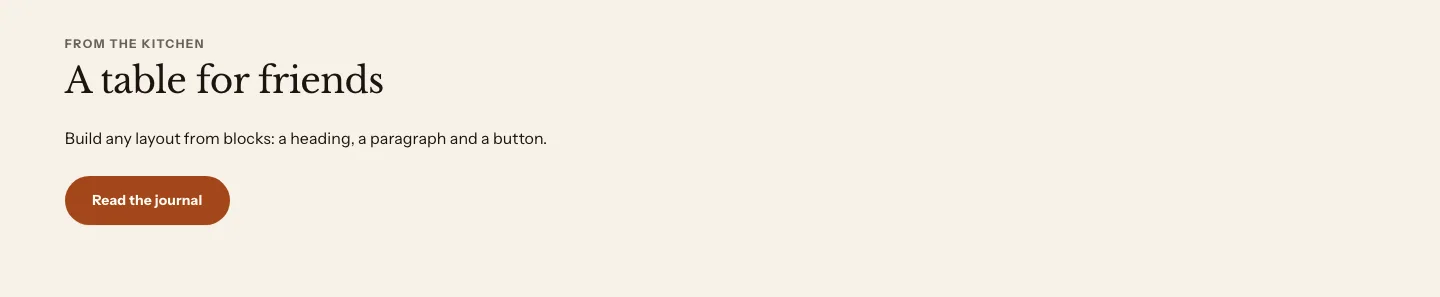
You can add these blocks:
- Theme blocks, such as Heading, Text, Button and Image
- App blocks from apps you install
- Stacked places the blocks in one column, one under the other.
- Side by side puts text beside one other block. Headings and text sit on one side, and a single image, video, quote or Group sits on the other. If the section has only one kind of block, it places the blocks in a row of equal columns instead, one column for each block. If it has several text blocks and several other blocks, it stays in one column, so put extra buttons or media in a Group. With Right alignment, the sides swap.
Learn about each block in Theme blocks.
Settings
These settings apply to every custom section: the blank section and the divider on this page, and the rich text, brand statement, pull quote, before and after, and collapsible content sections.
Layout
- Direction: Stacked places the blocks one under the other. Side by side puts text beside one other block. Put extra buttons or media in a Group.
- Alignment: Where the blocks and their text sit across the section. With Side by side, Right swaps the two sides.
- Vertical position: How the columns line up with each other from top to bottom, with Side by side selected.
- Stack on mobile: Places the columns one under the other on screens narrower than 750 pixels, with Side by side selected. Turn it off to keep the blocks side by side on phones.
- Spacing: The space between the blocks. The steps read as clearly different sizes.
- Content width: How wide the section's content can get. Narrow suits a paragraph of text. Wide spans the page column, so the section lines up with the sections around it. Side by side steps up one width, so two sides have room.
Section style
- Color scheme: The colors of the section.
- Vertical padding: The space above and below the section.
Other versions of the custom section
Several sections in other categories are custom sections that come with blocks already added. They have the settings above.
- Rich text, Brand statement and Pull quote are under Text. Learn more in Text. For collapsible content, use the FAQ section.
- Before and after is under Storytelling. Learn more in Storytelling.
Divider
A divider is a custom section with a Divider block and small padding. Use it to draw a line between two sections, such as between a product grid and a story. Select the Divider block to choose a solid line, a dashed line or an ornament, and to set a short line’s length. Learn more about the Divider block.
A divider section shows only the settings that change it, so Direction and Spacing don’t appear. It starts centered.
Spacer
A spacer adds space between two sections. It isn’t listed in the Add section list. Add a Blank section instead, set Vertical padding to None, and then add a Spacer block to it. Select the Spacer block to choose the height. Learn more about the Spacer block.
Apps
The apps section holds app blocks, stacked in a full-width band. Use it for app content that needs its own place on the page, such as a reviews widget, a loyalty program or a delivery date picker.
You can add these blocks:
- App blocks from apps you install
- Custom Liquid
The section has no heading of its own. To add a heading above your apps, add a Blank section with a Heading block just before the apps section.
Settings
Section style
- Color scheme: The colors of the band around the apps. Some apps use their own colors.
- Vertical padding: The space above and below the band.
Custom Liquid
The Custom Liquid section adds your own Liquid, HTML or CSS as a section, with the theme’s color scheme and padding around it. Use it for code from a service you use, such as an embedded form or a booking widget, or for a short piece of Liquid that shows store data.
Settings
- Custom Liquid: Runs as written, so an error in the code can break the page.
Section style
- Color scheme: The colors of the section around your code.
- Vertical padding: The space above and below the section.
When your code prints nothing on a page, for example because it checks for a condition that isn’t true there, the section takes no space on that page.
To add code inside another section, such as a product’s information or a slideshow, use the Custom Liquid block instead.
Section
Section is the container that Shopify places around a theme block when the block is added to a template on its own, without a section. This happens when Shopify’s AI tools, such as Sidekick, generate a block for your theme. You don’t add it from the Add section list.
You can add these blocks:
- Theme blocks, such as Heading, Text, Button and Image
- App blocks from apps you install
The section stacks its blocks in one column. You can move it, hide it and remove it like any other section.
Settings
Layout
- Alignment: Where the blocks and their text sit across the section.
- Content width: How wide the section's content can get.
Section style
- Color scheme: The colors of the section.
- Vertical padding: The space above and below the section.
Related
- Learn more about theme blocks.
- Learn more about adding sections and blocks.
- Learn more about using apps with your theme in Shopify’s Help Center.