Choose a theme style
A theme style is a starting look for Heirloom. Heirloom has five, each made for a different kind of store, from a pantry brand to a small clothing label, and you choose one when you add the theme to your store.
- HeirloomA warm, classic look for olive oil, honey, coffee and pantry makers.Headings: Libre Baskerville. Body: Instrument Sans.
- MarigoldA bright, busy storefront for grocers with hundreds of pantry staples.Headings: Archivo Bold. Body: DM Sans.
- FoxgloveA dark, editorial storefront for a small clothing label.Headings: Lora Medium. Body: Karla.
- LarkspurA light, airy shop for a single product, like a sparkling lemonade.Headings: Jost. Body: Jost.
- HoneysuckleA soft, gift-ready look for jam, preserves and pantry gift boxes.Headings: Lora Medium. Body: Nunito Sans.
What a theme style sets
A theme style sets two things.
- Theme settings: Each style has its own color schemes, sale color, heading and body fonts, page width, spacing, Corner style, button style and product card look. These stay in theme settings, so you can change any of them later.
- Templates, when you add the theme: Each style comes with its own home page, default product template and default collection template. Some styles also have their own header and footer layout.
Templates are only set when you add Heirloom. Changing the theme style later changes theme settings only.
The five theme styles
Heirloom
A warm, classic look for a small catalog, such as olive oil, honey, coffee or pantry goods.
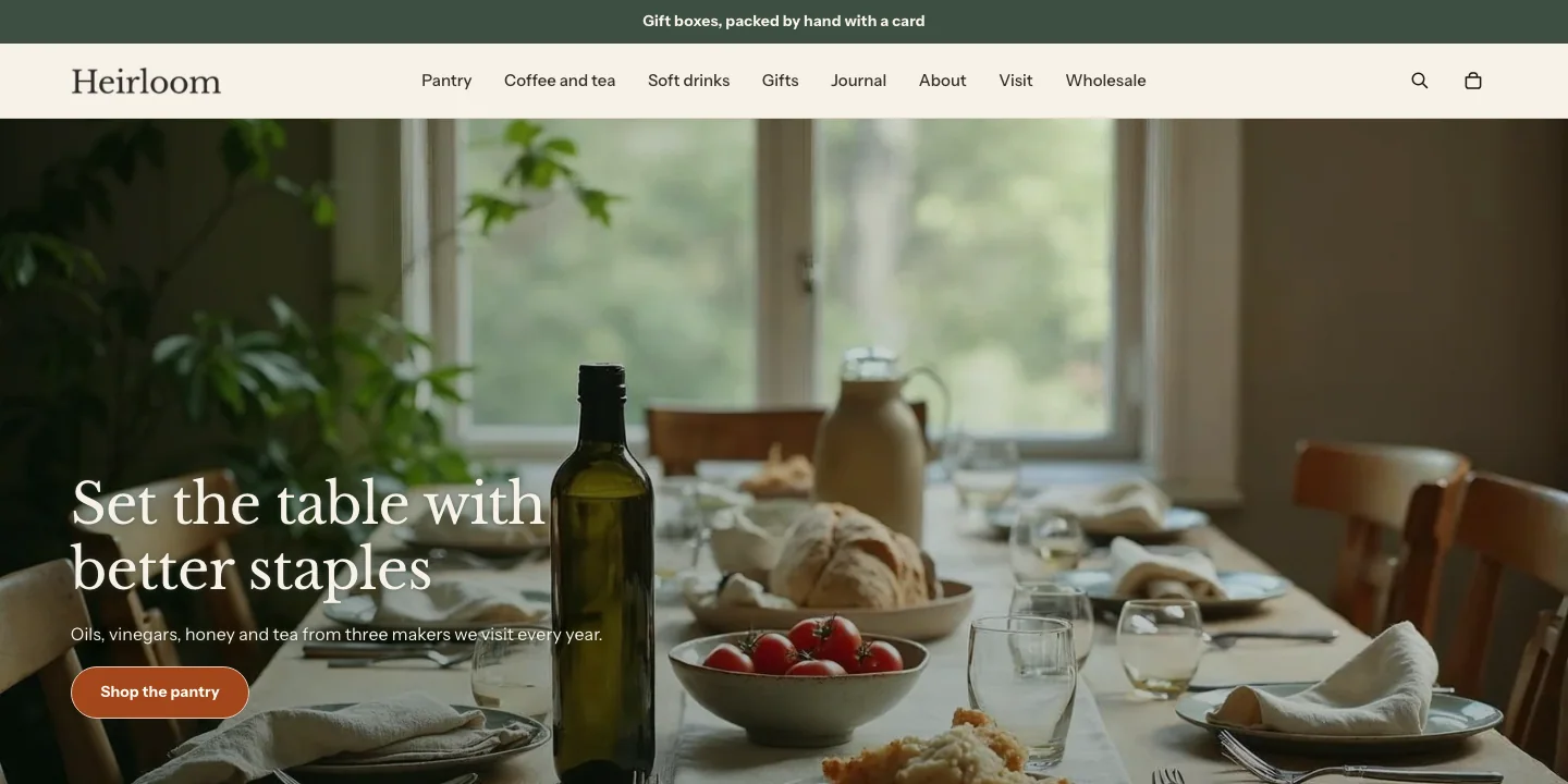
- Colors: a cream background, terracotta buttons, a pale sage Soft band and a deep green inverse scheme.
- Fonts: Libre Baskerville for headings and Instrument Sans for body text.
- Buttons and cards: Round corners, so buttons are pill-shaped, with text as typed. Plain product cards with portrait images, text aligned to the left and quick add. The standard page width.
- Header: the logo on the left, menus that open a mega menu when an item’s links have links of their own, and a search icon.
- Home page: Slideshow, Marquee, Collection list, Featured collection, Media with text, Lookbook, Collection tabs, Promo tiles, Featured product, Pairings, Featured blog, Gallery and Newsletter.
- Product and collection pages: product media on the left at medium width, with the product information staying in view as customers scroll, followed by Related products and Recently viewed. Filters in a sidebar.
Marigold
A bright, busy storefront for grocers and stores with hundreds of products.
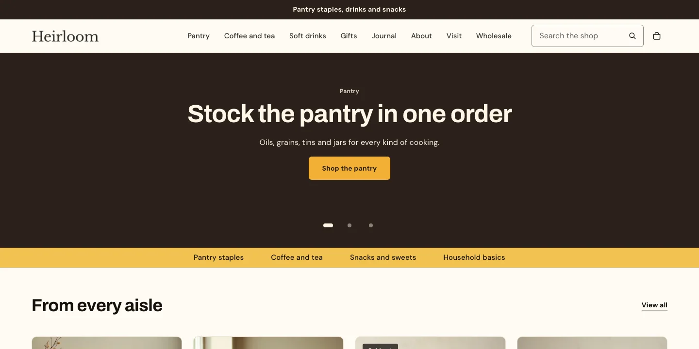
- Colors: a warm white background, burnt-orange buttons and marigold-gold bands, with a deeper cream for the Soft band so it stands apart from the page.
- Fonts: Archivo Bold for headings and DM Sans for body text.
- Buttons and cards: Soft corners, so buttons are slightly rounded, with text as typed. Framed product cards with square images, the vendor shown and sale badges that show the percentage off. The widest page width of the five styles.
- Header: the logo on the left, menus that open a mega menu when an item’s links have links of their own, and a search field that’s always visible on large screens.
- Home page: Slideshow, Marquee, Featured collection, Promo tiles and Newsletter.
- Product and collection pages: small product media, which leaves more room for the product information, followed by Related products and Recently viewed. Filters in a row above the products.
Foxglove
A dark, editorial storefront for a small clothing label with a short collection.
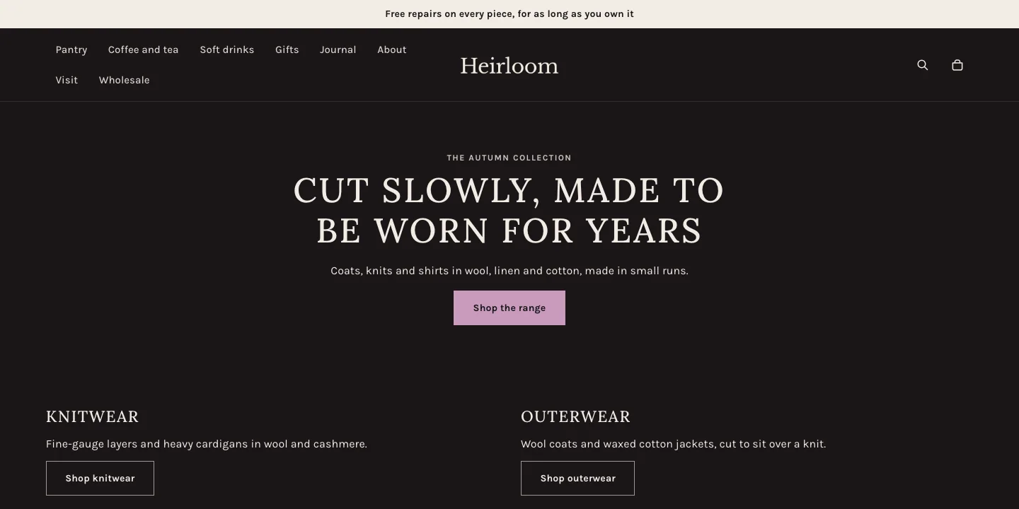
- Colors: warm charcoal pages with ivory text and mauve buttons. Aubergine shows in one place, the Strong band, and the inverse scheme is a light parchment.
- Fonts: Lora Medium in capitals for headings and Karla for body text. Headings run a little smaller than in the other styles.
- Buttons and cards: Square corners throughout, with button text as typed. Plain product cards with tall images and centered text, without quick add.
- Header: the menu on the left and the logo in the center, with dropdown menus and a search icon. The header doesn’t stay in view as customers scroll.
- Home page: a full-screen Media banner, Columns with two short columns, two Media with text sections, Featured collection, Lookbook, Featured product and Newsletter.
- Product and collection pages: large product media on the left, followed by Related products and Recently viewed. Filters in a drawer that opens from a button, with the whole collection description above the products.
Larkspur
A light, airy shop for one product, such as a sparkling lemonade.
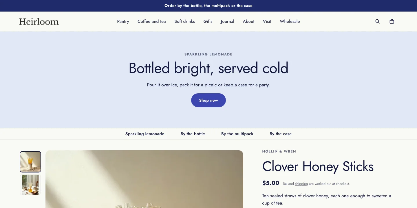
- Colors: a warm white background, a sand Soft band, a pale sky Band, a periwinkle Strong band, larkspur-blue buttons and a footer on the pale sky Band.
- Fonts: Jost Regular for headings and Jost for body text.
- Buttons and cards: Round corners, so buttons are pill-shaped, with text as typed. Filled product cards with square images and centered text. The standard page width.
- Header: the logo on the left, dropdown menus and a search icon. The header doesn’t stay in view as customers scroll.
- Home page: Media banner, Marquee, Featured product, Featured collection (hidden), Media with text, Process steps with icons, Testimonials (hidden), FAQ and Newsletter.
- Product and collection pages: large product media on the right, followed by a Comparison table for pack sizes. Filters in a row above the products.
Honeysuckle
A soft, gift-ready look for jam, preserves and gift boxes.
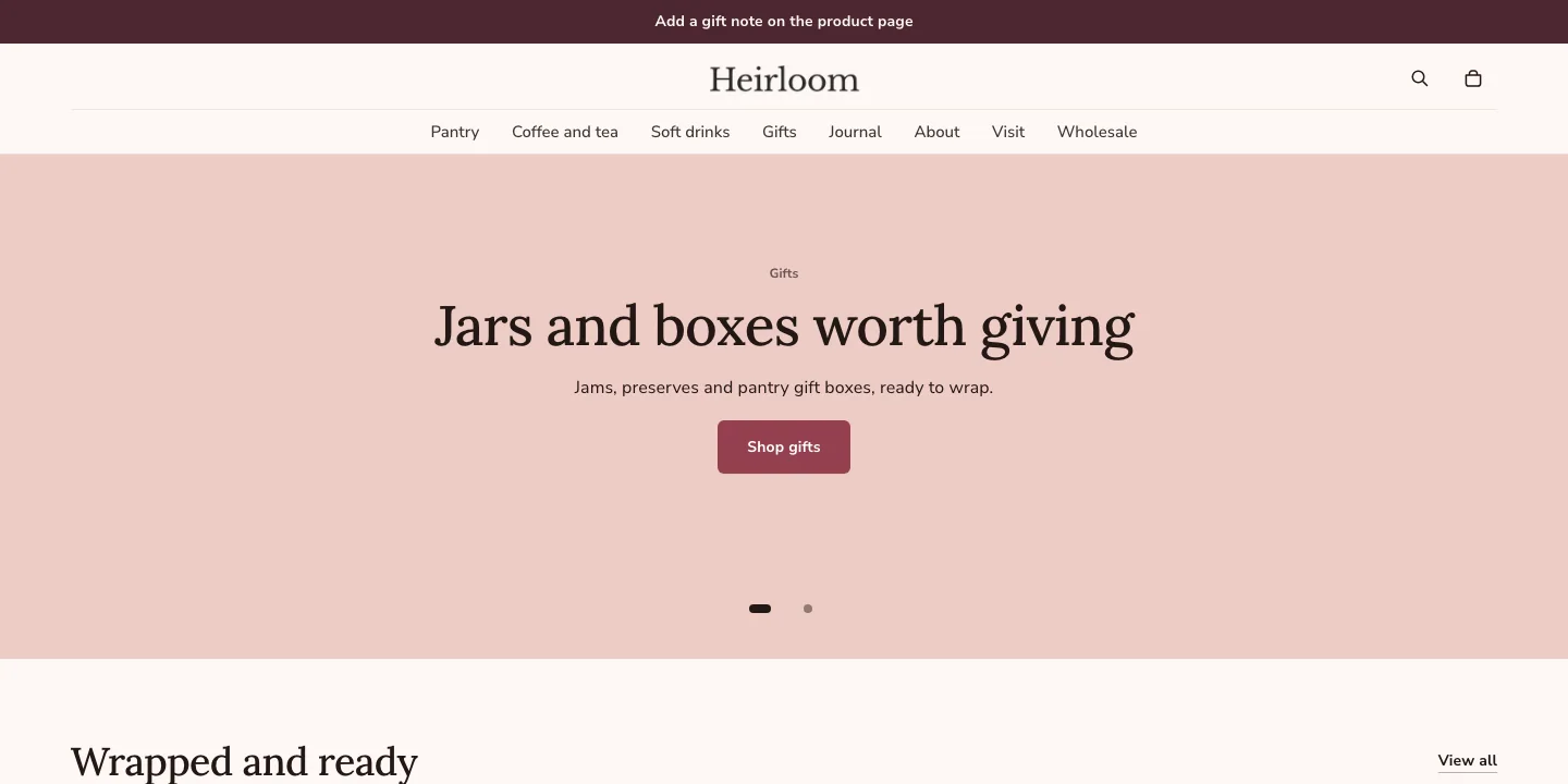
- Colors: a blush background, a blush Soft band, a butter-yellow Band, a deeper rose Strong band and raspberry buttons.
- Fonts: Lora Medium for headings and Nunito Sans for body text.
- Buttons and cards: Soft corners, so buttons are slightly rounded, with text as typed. Filled blush product cards with square images and centered text.
- Header: the logo in the center with dropdown menus below it, and a search icon.
- Home page: Slideshow, Collection list, Featured collection, Media with text, Testimonials (hidden), Featured blog, FAQ and Newsletter.
- Product and collection pages: product media on the left at medium width and a gift message field, followed by Featured collection and Related products. Filters in a sidebar, with Recently viewed below the products.
Hidden sections and the newsletter
Every style’s home page ends with a Newsletter section, so the footer’s own signup steps aside on the home page.
Sections marked (hidden) come with the style but are hidden until you need them. Two kinds are hidden. The Testimonials sections in Larkspur and Honeysuckle need real quotes from your customers. Larkspur’s Featured collection would repeat the Featured product’s card in a store with one product, so show it once you sell more than one. Customers don’t see a hidden section. In the theme editor, it’s listed in the sidebar with the other sections.
Steps:
- From your Shopify admin, go to Online Store > Themes.
- Find Heirloom, and then click Edit theme.
- In the sidebar, click the hidden section and add its content.
- Hover over the section in the sidebar, and then click the show icon.
- Click Save.
Change your theme style
You can switch Heirloom to another theme style at any time. Choose the style first, and then adjust colors and fonts, because switching replaces them.
Steps:
- From your Shopify admin, go to Online Store > Themes.
- Find Heirloom, and then click Edit theme.
- Click the Theme settings icon.
- Click Theme style.
- Select the theme style that you want, and then click Change style.
- Click Save.
Changing the style applies the new style’s theme settings: colors, fonts, spacing, corners, buttons and product cards. Your templates, sections, blocks and content stay as they are, so your home page keeps its sections and your header keeps its layout.
The sections, blocks and settings that you set on a template or in the header and footer stay as they are, even when they use a color scheme. A section keeps pointing at the same color scheme, which now has the new style’s colors.
To give your home page the sections of another style, add them yourself from the Add section list. Each style’s home page is listed above by section name.
Related
- Learn more about customizing Heirloom.
- Learn more about colors and color schemes.
- Learn more about theme styles in Shopify’s Help Center.