Sections in Heirloom
Sections are the horizontal bands that make up each page of your online store, such as a banner, a featured collection or an FAQ. This page lists every section that you can add in Heirloom, and explains where each kind of section can go.
To add a section, open a template in the theme editor and click Add section. Learn how in Customize Heirloom.
Find a section
The Add section list groups Heirloom’s sections by category. Each category has its own page in this Help Center:
Banners
Promo banner, Media banner, Slideshow
Products
Quick order list, Collection tabs, Featured collection, Featured product, Recently viewed, Related products
Collections
Collection list
Text
Comparison table, Rich text, Brand statement, Pull quote, FAQ, Columns, Tabbed content
Storytelling
Before and after, Featured blog, Timeline, Promo tiles
Media
Gallery, Logo list, Media with text, Lookbook, Marquee, Collage
Food and drink
Pairings, Recipe, Tasting notes
Trust and reviews
Testimonials, Trust bar
Store and contact
Contact form, Map, Newsletter, Store hours
Layout
Apps, Custom Liquid, Blank section, Divider
One section can take several forms. A Featured collection can show a collection or a set of products that you choose, and Columns can be plain text, an icon list or numbered steps. Some forms, such as a Product set, have no entry of their own in the Add section list. Each category page explains how to build them.
Template sections and section groups
Most sections belong to one template. You add them to a template, such as your home page or a product template, and they show only on pages that use that template.
The header and the footer are section groups. A section group shows on every page of your online store, so you edit it once:
- The header group holds the Announcement bar, the Header, the Age gate and the Cart drawer. You can also move the Newsletter popup into it. Most other sections can’t be added to the header group. Learn more in Header and announcement bar and Popups and age verification.
- The footer group holds the Newsletter popup and the Footer. You can also add many other sections to the footer group, to show them above the footer on every page, such as a trust bar or a newsletter signup. Learn more in Footer.
Sections that come with templates
Some templates have a main section that holds the page’s own content, such as the product details on a product page. These sections aren’t in the Add section list, because each one belongs to its template. You change them like any other section, with their settings and blocks.
| Section | Template | Learn more |
|---|---|---|
| Product | Product templates | Product pages |
| Collection | Collection templates | Collection pages |
| Collections grid | The page that lists all your collections | Collection pages |
| Search | Search results | Search |
| Cart | Cart page | Cart |
| Blog and Article | Blog and blog post templates | Blogs and recipes |
| Page | Page templates | Templates in Heirloom |
| Page not found | The 404 page | Templates in Heirloom |
| Password | The password page | Templates in Heirloom |
| Agent guide | The agents page template | Agents and MCP |
Related products works only on product templates, because it recommends products based on the product that the customer is viewing. Learn more in Products.
Sections you can add once
These sections can be added only once to each template or section group:
- FAQ, so each page has one list of questions for search engines to read.
- Recipe.
- The Header, Announcement bar, Age gate, Cart drawer, Newsletter popup and Footer.
Section headers
Sections that show a list, such as Featured collection, Columns, FAQ and Testimonials, start with a Section header. It’s the area above the list that holds the section’s heading. It takes theme blocks, so you can add a line of text, a button or an image beside the heading. To change it, click Section header under the section in the sidebar.
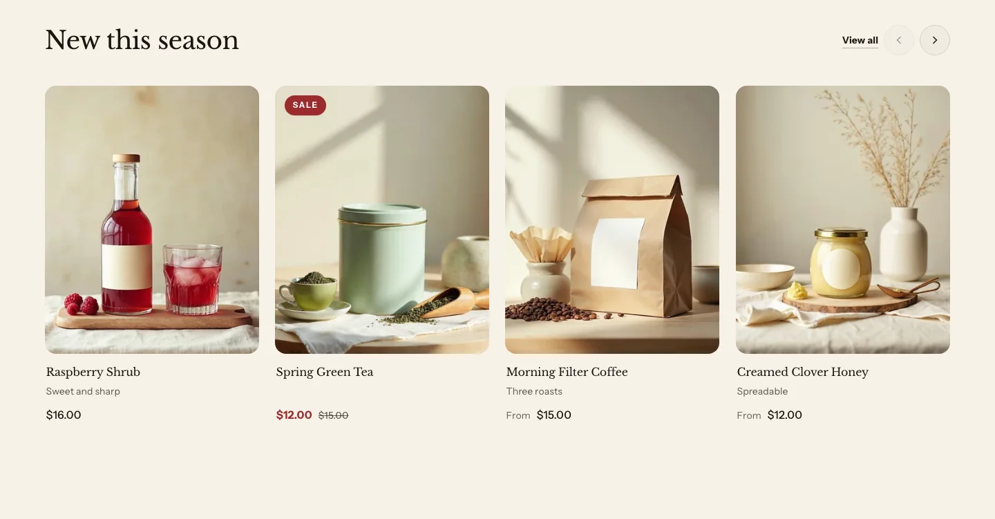
- Layout: Split puts the last block at the end of the row, so it needs two blocks.
- Alignment: Where the header's blocks sit when Layout is Stacked.
With Layout set to Split, the last block sits in its own column at the end of the header, lined up with the bottom of the others. Put a button there, such as a Shop all link beside the heading. On phones, the end column moves below the rest. Split needs at least two blocks.
Settings most sections share
Most sections end with two settings:
- Color scheme picks one of your theme’s color schemes for the section’s background, text and buttons. Learn more in Colors.
- Vertical padding sets the space above and below the section: None, Small, Medium or Large.
Related
- Learn more about adding sections and blocks.
- Learn more about theme blocks.
- Learn more about templates in Heirloom.