Store and contact
Store and contact sections help customers reach you and find you: a contact form, a newsletter signup, a map of your shops, your opening hours, and a strip of contact details. You find them under Store and contact in the Add section list.
Add a store or contact section
Steps:
- From your Shopify admin, go to Online Store > Themes.
- Find Heirloom, and then click Edit theme.
- Open the template that you want to change, and then click Add section.
- Under Store and contact, select a section.
- Click Save.
Contact form
The contact form section shows your store’s contact form, with fields for a name, an email address, a phone number and a message. Name, email and message are required, and the phone number is marked as optional. You can turn the phone number off, and you can reword the button and the confirmation. Add it to your contact page so customers can ask about an order, a wholesale account or a custom hamper.
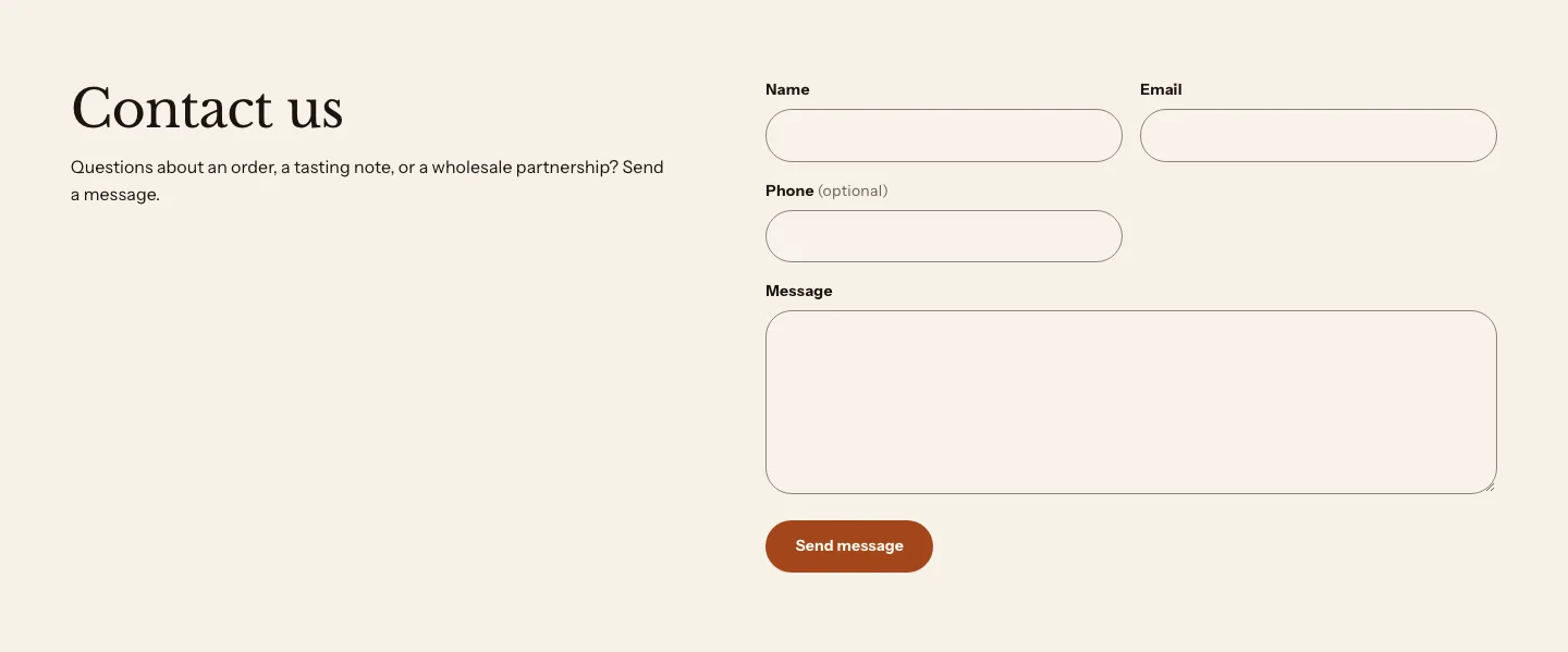
You can add these blocks above the form:
- Theme blocks, such as Heading, Text, Button and Image
- App blocks from apps you install
- Heading
- Text
The section comes with a Heading and a Text block. It doesn’t show the page’s own title or content, so on a page template the page title stays the main heading. Set your heading block’s Heading level to suit its place on the page.
On a computer screen the heading and text sit on the left with the form beside them on the right, so the section spans the page. On tablets and phones they sit above the form. With no heading or text the form starts at the left edge on its own. When a page section with the page title comes before it, the title starts at the same left edge.
The form works without JavaScript. After a customer sends it, the page reloads at the form and shows a confirmation, or a message about the fields that need fixing.
Settings
Form
- Show phone field: Shows the optional phone number field. Turn it off to ask only for a name, an email address and a message.
- Button label: Leave blank to use "Send message".
- Success message: Shown above the form after a send; blank uses the standard thank you.
Layout
- Content width: How wide the form can get. Narrow and Standard keep the fields at a comfortable reading width, and Wide is wider still. Beside the heading on a computer screen, it is the width of the form on the right.
Section style
- Color scheme: The colors of the section and the form fields.
- Vertical padding: The space above and below the section.
Where messages go
Messages from the contact form are emailed to your store’s sender email address. You can change the sender email in your Shopify admin, from Settings > Notifications. Learn more about contact forms in Shopify’s Help Center.
Contact strip
A contact strip is a trust bar set up for your contact details: three plain items, Email, Phone and Visit, each with an icon, under a “Get in touch” heading. To make one, add a Trust bar under Trust and reviews, set Columns on desktop to 3 and Style to Plain, and then give each item an icon, a heading and your details in its Text. Use Link to send customers to your contact page or your store locations.

A contact strip has the same settings as the trust bar. Learn more in Trust bar.
Map
The map section shows cards for your locations, such as a shop, a market stall or a pickup point, beside a map that you embed from a maps service. Each card can show the location’s name, address, hours, phone number and a button, such as a link to directions.
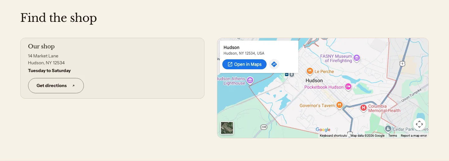
You can add these blocks:
- Location
- Custom Liquid
- App blocks from apps you install
Add a heading above the cards in the section’s Section header block. Each Location block is one card.
Steps:
- In your maps service, find your location, and then copy the code it gives you to embed the map. It usually starts with
<iframe. - In the theme editor, select the map section.
- Paste the code into Map embed HTML.
- Click Save.
The header sits above the cards and the map, so the first card and the map start on one line. On large screens, the map sits beside the cards. On smaller screens, the map sits under them. The settings for the map’s position, width and height appear after you paste an embed code.
Settings
Map
- Map embed HTML: Paste the embed code a maps service gives you, such as an iframe.
- Image position: Which side of the cards the map sits on, on large screens.
- Image width: How much of the row the map takes, on large screens.
- Map height: How tall the map is.
- Sticky map on large screens: Keeps the map in view while customers scroll past a long list of locations. For customers who set their device to reduce motion, the map scrolls with the page instead.
Section style
- Color scheme: The colors of the section and the cards.
- Vertical padding: The space above and below the section.
Location settings
- Location name: The name of the location. The theme editor uses it to name the block in the sidebar.
- Address: The location's address, on as many lines as you need.
- Hours: When the location is open, such as Tue to Sat, 9:00 to 17:00.
- Phone: The location's phone number. Customers can tap it to call.
- Button label: The text on the card's button, such as Get directions. The button shows when it has both a label and a link. It's a secondary button.
- Button link: Where the button goes, such as a directions link from your maps service.
- Open in new tab: Opens the button's link in a new browser tab. It shows when the button has a link.
Newsletter
The newsletter section shows an email signup form, with a heading and text above it. Use it to invite customers to hear about new harvests, seasonal boxes or restocks.

You can add these blocks above the form:
- Theme blocks, such as Heading, Text, Button and Image
- App blocks from apps you install
- Heading
- Text
The form itself is an Email signup block that’s always part of the section. Select it in the sidebar to change its placeholder, button label, layout, privacy note and its success and error messages. Learn more about the Email signup block.
Settings
Layout
- Alignment: Where the blocks and the form sit across the section.
- Content width: How wide the blocks and the form can get. The form follows it: about 24 rem wide on Narrow, 30 rem on Standard and 36 rem on Wide.
Section style
- Color scheme: The colors of the section and the form.
- Vertical padding: The space above and below the section.
Where signups go
Each signup adds the email address to your store’s customers, with the tag newsletter, and records that the customer agreed to receive email marketing. Find your subscribers in your Shopify admin, on the Customers page, in the Email subscribers segment.
If you turn on double opt-in for email marketing in your Shopify admin, customers confirm their subscription from an email before they’re subscribed. Learn more about collecting customer contact information in Shopify’s Help Center.
Store hours
The store hours section shows your opening hours beside your store’s address, phone number and email. Use it on your contact page, or on a page for a shop or a pickup point.
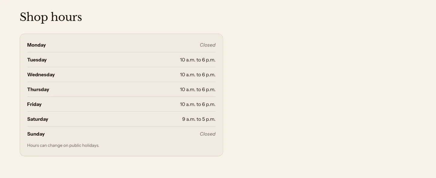
You can add these blocks:
- Hours row
- Custom Liquid
- App blocks from apps you install
Add a heading above the contact details in the section’s Section header block. Each Hours row block is one line of the list, such as Monday, or Mon to Fri.
Settings
Layout
- Direction: Side by side places the contact details and the hours in two columns on wider screens. Stacked places the hours under the contact details.
- Style: Plain shows the hours on the section background. Card draws them on their own panel.
- Content width: How wide the section can get. Standard and Wide cap the section at a reading width and center it. Full width, the default, spans the page column, so sections that you saved keep their look. Side by side stacks on Standard, which is too narrow for two columns.
- Note: A short line under the hours, such as a holiday change.
- Closed label: Shown on a row marked closed; blank uses "Closed".
Contact details
- Show contact details: Blank address and phone use your store settings.
- Address: The address to show. Leave it blank to use your store's address.
- Phone: The phone number to show. Customers can tap it to call. Leave it blank to use your store's phone number.
- Email: The email address to show. Customers can click it to write to you. Leave it blank to show no email. Your store's own email is the address that Shopify sends from, so the section never shows it for you.
- Phone label: Leave blank to use "Phone".
- Email label: Leave blank to use "Email".
- Button label: The text on a button under the contact details, such as Plan your visit.
- Button link: Where the button goes. Leave it blank to link to your home page.
Section style
- Color scheme: The colors of the section.
- Vertical padding: The space above and below the section.
Hours row settings
- Day: A day or a range, such as Monday or Mon to Fri.
- Hours: Such as 9:00 to 17:00; a day with no hours shows only when it is closed.
- Mark as closed: Shows the day as closed, in place of hours.
A new store hours section starts with sample hours, from 9:00 to 18:00 on weekdays, 10:00 to 16:00 on Saturday and closed on Sunday. Change them to your own. Phone label, Email label and Closed label reword the small labels and the word on a closed row, and a blank one uses the word in each customer’s language.
Related
- Learn more about trust bars.
- Learn more about store hours and local pickup.
- Learn more about contact forms in Shopify’s Help Center.